Automated File Management: Enhancing Workflow Efficiency by 70% with Smart Folder Organization
Leveraging machine learning to automatically organize files, reducing search time by 45% and boosting overall productivity, leading to a seamless, time-saving user experience.
My Role
As the UX/UI designer for automated file manager, I was responsible for crafting a unique user experience that distinguished this automated file management platform from other organization tools. Collaborating closely with my project manager and design team, I led the effort to identify and address critical user pain points through in-depth user research and competitor analysis.
Through a comprehensive design process, I conceptualized and developed intuitive, user-centered interfaces and prototypes, ensuring a seamless experience for managers, software developers, and a wide range of other users. By harnessing machine learning, This is a smart folder organization feature enhances workflow efficiency, offering users a streamlined way to manage and locate files across integrated platforms like Google Drive. This resulted in a responsive, cohesive UX that dramatically improves productivity by reducing search time and enhancing overall user satisfaction.
Team Structure
3 Designers (Including me), 1 Developer
Research Methods
Competitor analysis, User research, User flow
Discipline
UX Design, UX Research, UI Design
Platform
Web
Time frame
July 2024 - Oct 2024
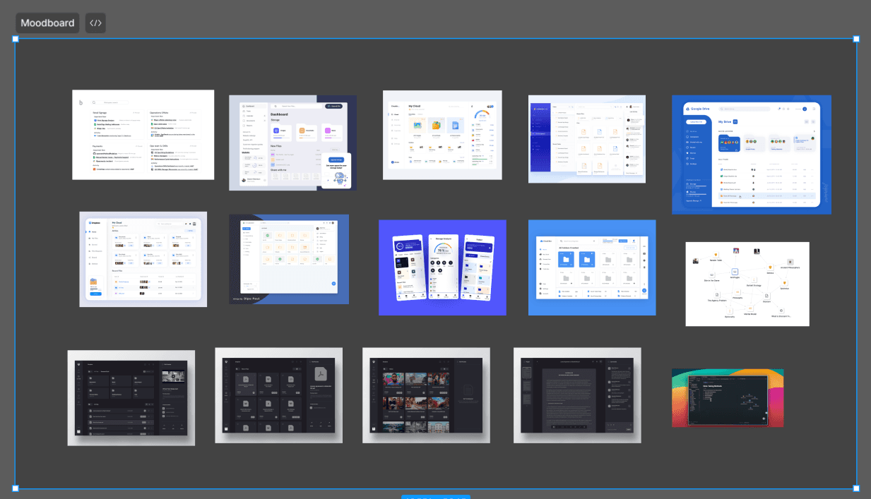
Mood Board
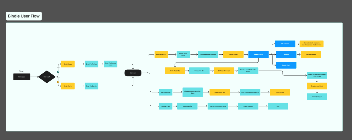
User Flow
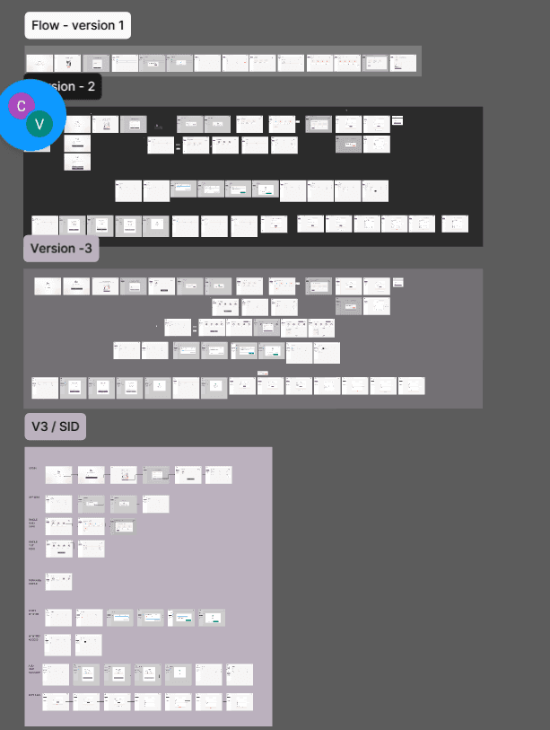
Iterations
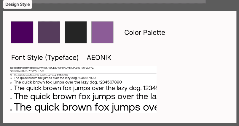
Design style
folders
Folder Creation
(A sneak - peek of my thinking and design process)
Through mood boards, iterative wireframing (V1, V2, VE versions), user flows, and a cohesive design system with a defined color palette and typography (Aeonik), we crafted a user experience that resonated with business professionals and elevated the platform's usability and visual appeal.
Objectives
Perform an in-depth assessment of user needs, preferences, and pain points to ensure the file’s design meets diverse user expectations. Identify workflows that could benefit from automation and reduce repetitive tasks for a more efficient experience.
Simplify the file's user journey by presenting clear, accessible information on file organization processes and machine learning-driven smart folders. Aim to reduce cognitive load and make features easily discoverable to support intuitive navigation and increase user adoption.
Refine file's interaction flows and architecture to facilitate a smooth, efficient experience. Prioritize task completion speed and ease of use, ensuring that Bindle seamlessly integrates with users’ daily workflows without creating unnecessary friction.
Strategic Value
Through comprehensive UX research and iterative design, the automated file manager seeks to position itself as a go-to solution for professionals who rely on streamlined file management to stay organized. Our approach focused on gathering insights from key user groups to address common pain points around document organization and retrieval. By leveraging machine learning, the file manager distinguishes itself from traditional organization tools by automatically sorting files, minimizing manual categorization, and providing predictive file suggestions based on user behavior. This strategic enhancement of usability and workflow optimization not only saves time but also strengthens the folder’s value proposition as a productivity-boosting platform, reinforcing its unique positioning in the digital workspace ecosystem.
Screens & Flows
Design Thoughts and Explaination
Onboarding Screens
Google authentication
App Integration
More Folderfff Creation
Creation on process
Old designs
Formed Folders screen
New designs
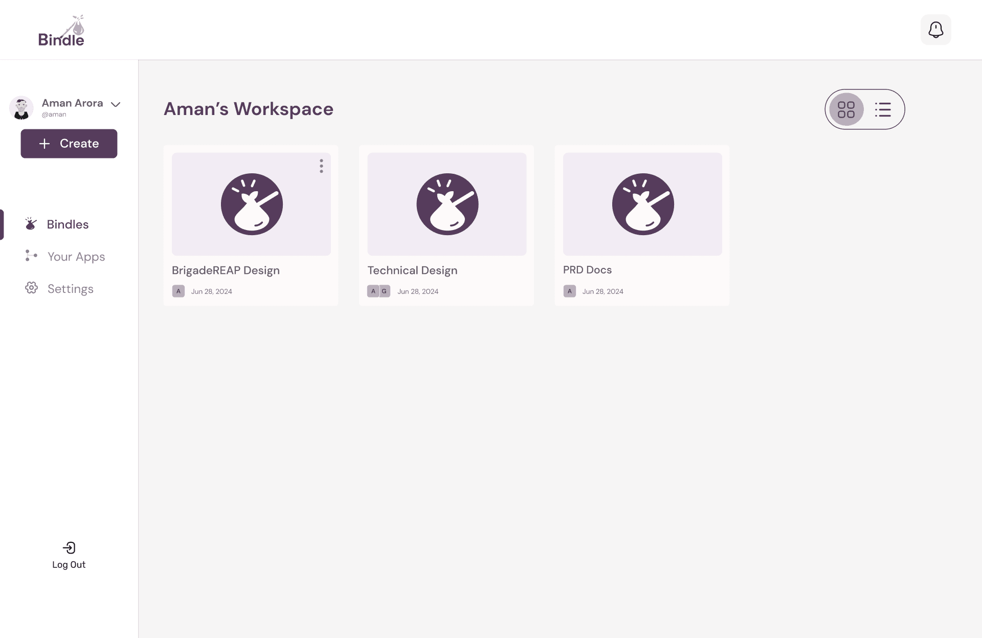
Existing New Screen - grid view

Existing Folders screen - List view
Dashboard Screens
Formed Folders screen - List view
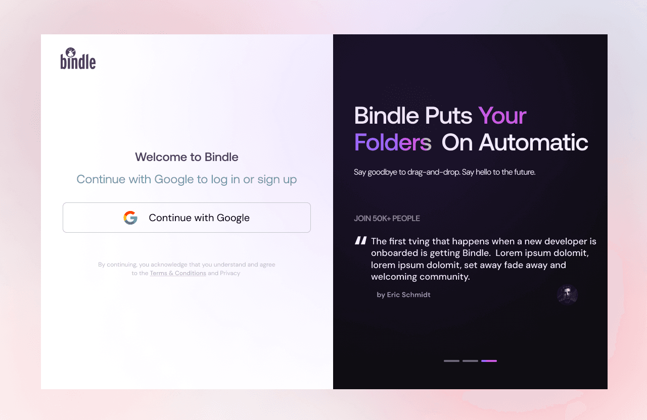
Google Authentication
Why it’s implemented: Google authentication simplifies the sign-up process, leveraging users' existing accounts to minimize friction. This follows Jakob’s Law, as users are already familiar with Google’s login interface, reducing cognitive load and increasing trust.
Value: It provides a seamless entry point while ensuring security and convenience, enhancing the user experience and improving retention rates.
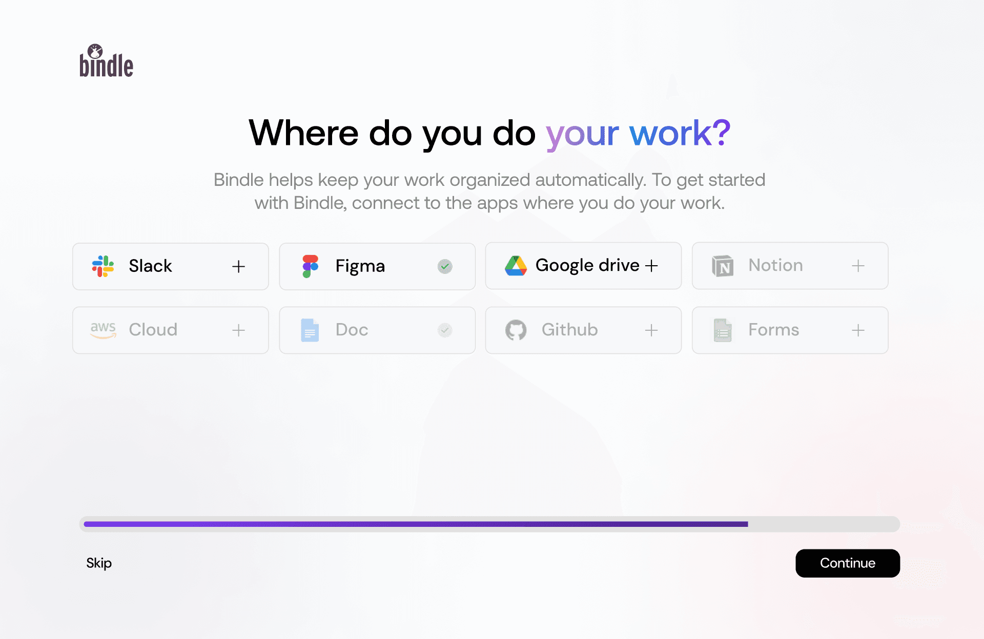
App Integration (e.g., Google Drive)
Purpose: This step allows users to integrate files with platforms like Google Drive, ensuring access to all stored files. Once connected, Bindle automatically analyzes and organizes files.
Functionality: For example, users can input key terms like "Tech Doc," enabling the system to auto-categorize all related files into a "Tech Doc Folder." This reflects principles of efficiency and automation in UX, reducing manual work for users.
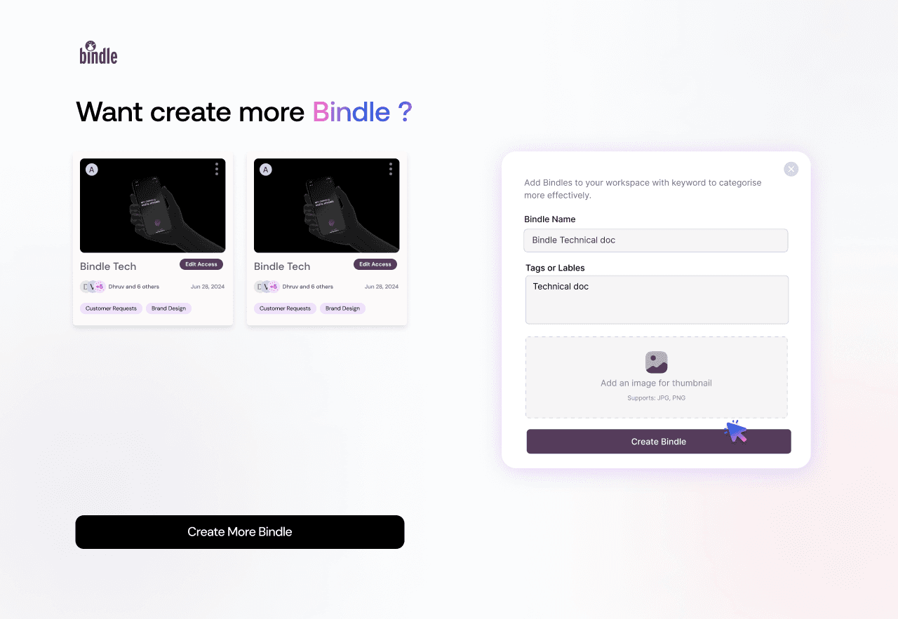
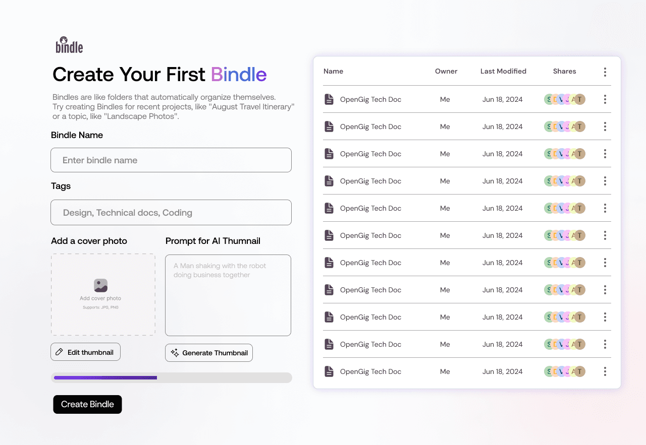
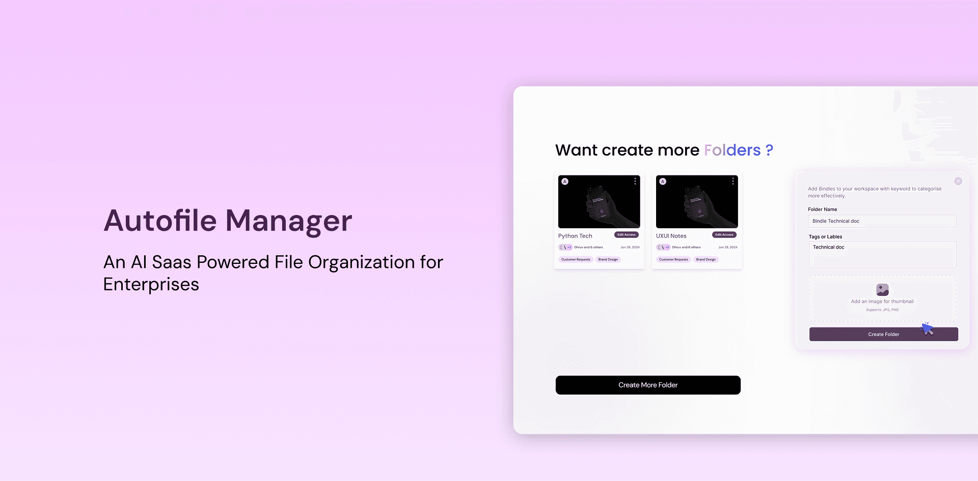
Bindle Creation
What it achieves: This screen offers users the ability to name and customize their first Bindle while showing a preview of the files being added. The clean layout aligns with the principle of progressive disclosure, presenting only necessary information to avoid overwhelming the user.
Outcome: Users feel empowered to tailor the tool to their needs, reinforcing engagement and utility.
Optional Additional Bindle Creation
User flexibility: If users want to organize more files, they can create multiple Bindles here. This reflects user control and freedom, an essential heuristic in UX design.
Efficiency: The interface simplifies repetitive actions, maintaining a consistent and enjoyable workflow.
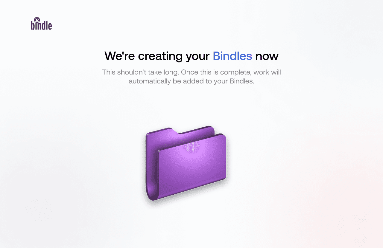
Creation in Process
What it conveys: This screen reassures users with a progress update while their files are being created. Using visual feedback, it keeps users informed and sets the right expectations about wait times.
Transition: Once completed, users are seamlessly guided to the dashboard, maintaining a smooth navigation flow.
Design Thoughts and Explaination
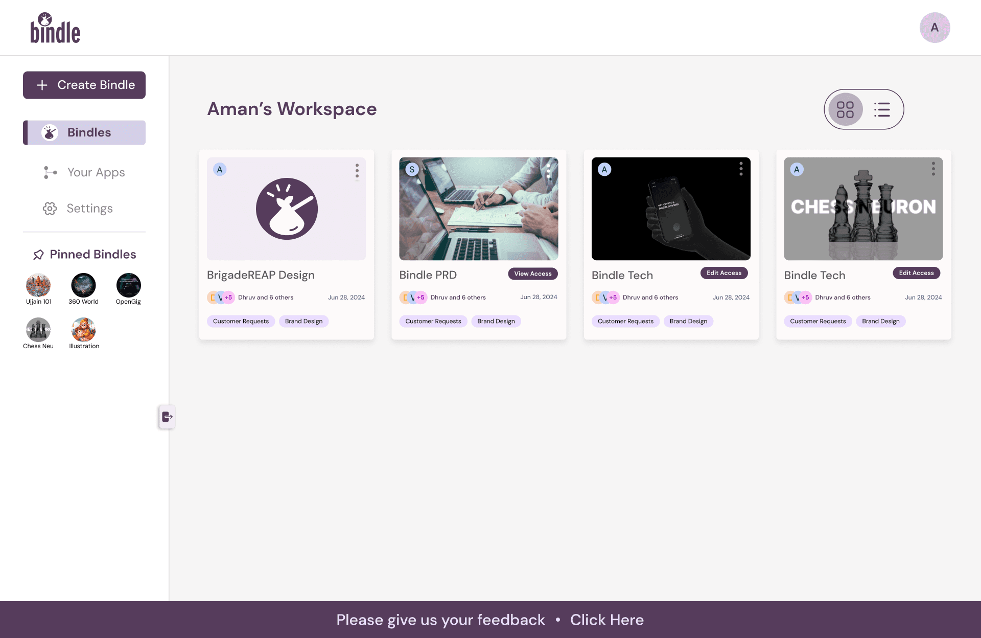
Grid View: Old Design vs. New Design
Visual Enhancements:
Old Design: The grid view in the old version used plain folder icons with minimal detail, which lacked clarity for users.
New Design: I decided to replace the basic folder icons with visually rich thumbnails during onboarding or adding it default that represent the folder's content. This design decision enhances visual hierarchy and ensures users can identify their folders at a glance, reducing cognitive load.
Information Display:
Old Design: Limited information was displayed, such as folder names and modification dates.
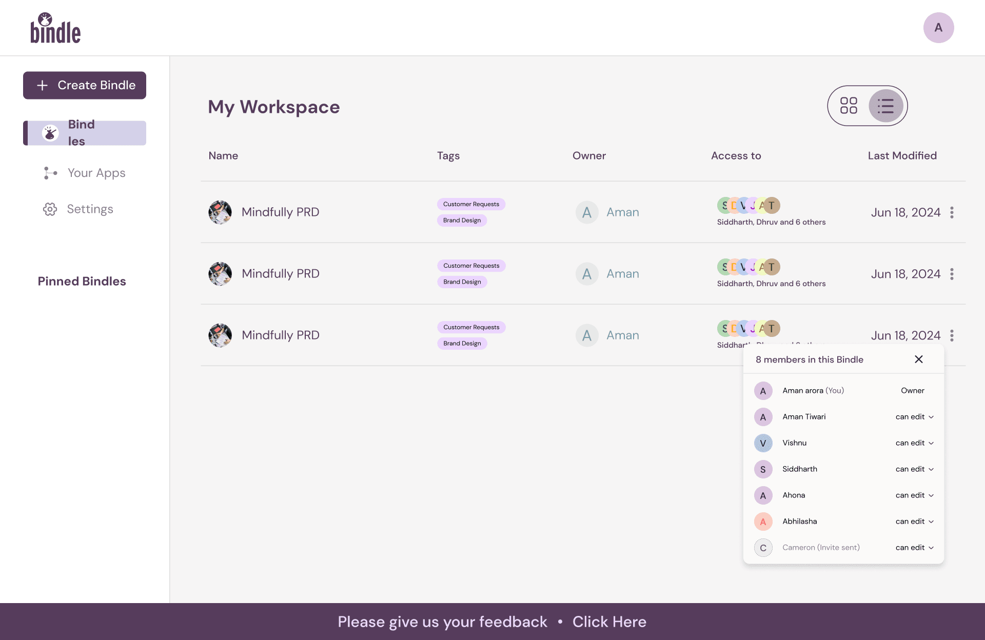
New Design: I introduced additional data points like tags and collaborators on each thumbnail. This ensures the interface is not only visually appealing but also data-rich, helping users make quicker, more informed decisions.
Interactivity:
Old Design: Grid items lacked interactive functionality.
New Design: I incorporated hover states and quick-access buttons for actions like sharing or deleting, improving discoverability and ensuring users have greater control directly from the dashboard.
Footer with Feedback Option:
I introduced a footer featuring a feedback link ("Please give us your feedback - Click Here"). This decision ensures a user-centered design approach, where users can directly share their thoughts, creating a more iterative and user-driven product.
Collaboration Features:
Collaborator icons were added to visually represent shared Folders. This decision aligns with system status visibility, ensuring users can quickly identify collaboration details without extra effort.
Modern Aesthetics:
I refined the overall layout, applying cleaner designs, improved color contrasts, and subtle shadows to create a modern and professional appearance. This was done to align with modern design standards, making the interface not only functional but visually appealing.
Customizable Views:
I implemented a toggle between grid and list views, offering flexibility and ensuring users can work with the layout that suits their preference. This decision reflects a user-centric approach, allowing personalization and catering to diverse workflows.
Improved Organization:
Old Design: Displayed folders in a basic table format with limited features.
New Design: I restructured the list view to include collaborator avatars, tag indicators, and detailed access information. These updates were driven by the need to prioritize clarity and usability, ensuring users can manage and track shared folders more efficiently.
Pinned Bindles:
Old Design: The feature to pin folders was absent, which caused users to spend time searching for frequently used files.
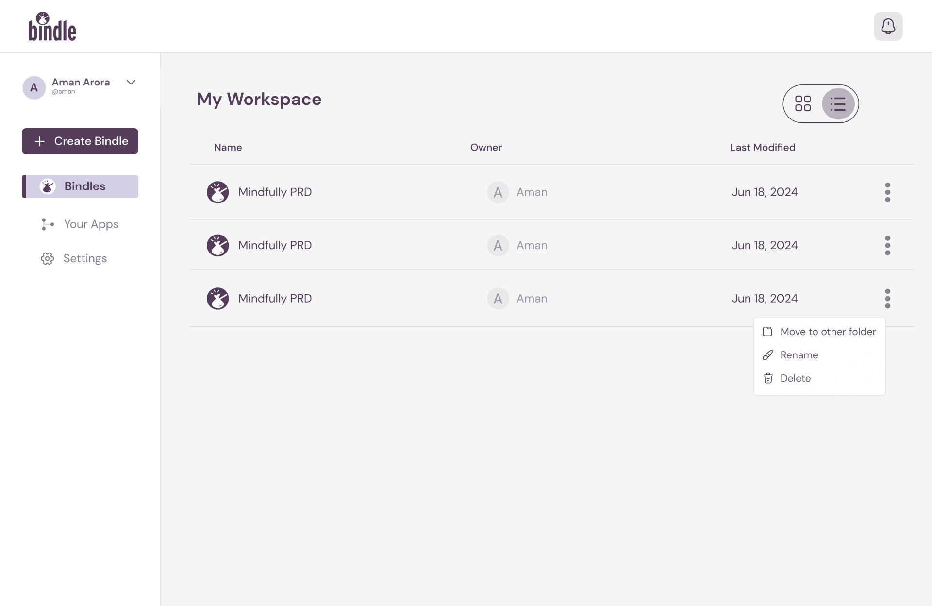
New Design: To improve user efficiency, I added a Pinned Folders section at the top, a decision inspired by the principle of prioritization. This ensures frequently accessed items are always within reach, reducing repetitive tasks.
Enhanced Action Options:
Old Design: Users had to navigate multiple steps to manage folders.
New Design: I integrated a dropdown menu for each Folder, allowing quick actions like renaming, sharing, or deleting. This addition supports user control and flexibility, making the list view highly functional.
Additional UX Insights
Impactful Communication: Each screen communicates file's core value of simplifying file organization through automation, following the principle of clarity to ensure users instantly understand the benefits.
Hick's Law Application: By minimizing unnecessary choices at each step, the onboarding flow reduces decision fatigue, guiding users intuitively toward completing their setup.
Consistency and Feedback: Maintaining a cohesive visual style and providing continuous feedback builds user confidence and satisfaction, key for improving retention.
Key Improvements and Design Decisions
Accessible Information: By surfacing critical details like tags, collaborators, and file status directly on the dashboard, I ensured users could access important data without additional navigation.
Streamlined User Flow: Features like pinned folders and dropdown menus simplify navigation, reducing friction in daily tasks.
Polished Visual Design: I prioritized aesthetic usability, creating an interface that is both functional and visually engaging.
Rationale for Updates: Every design decision was backed by user research insights and principles like Hick's Law (reducing choice complexity) and Jacob’s Law (users expecting familiar patterns).
These updates demonstrate my ability to design with a clear focus on user experience while ensuring that functional improvements align with user needs and business goals. By owning these decisions, I ensured that the redesign represents a thoughtful and impactful evolution of the platform.
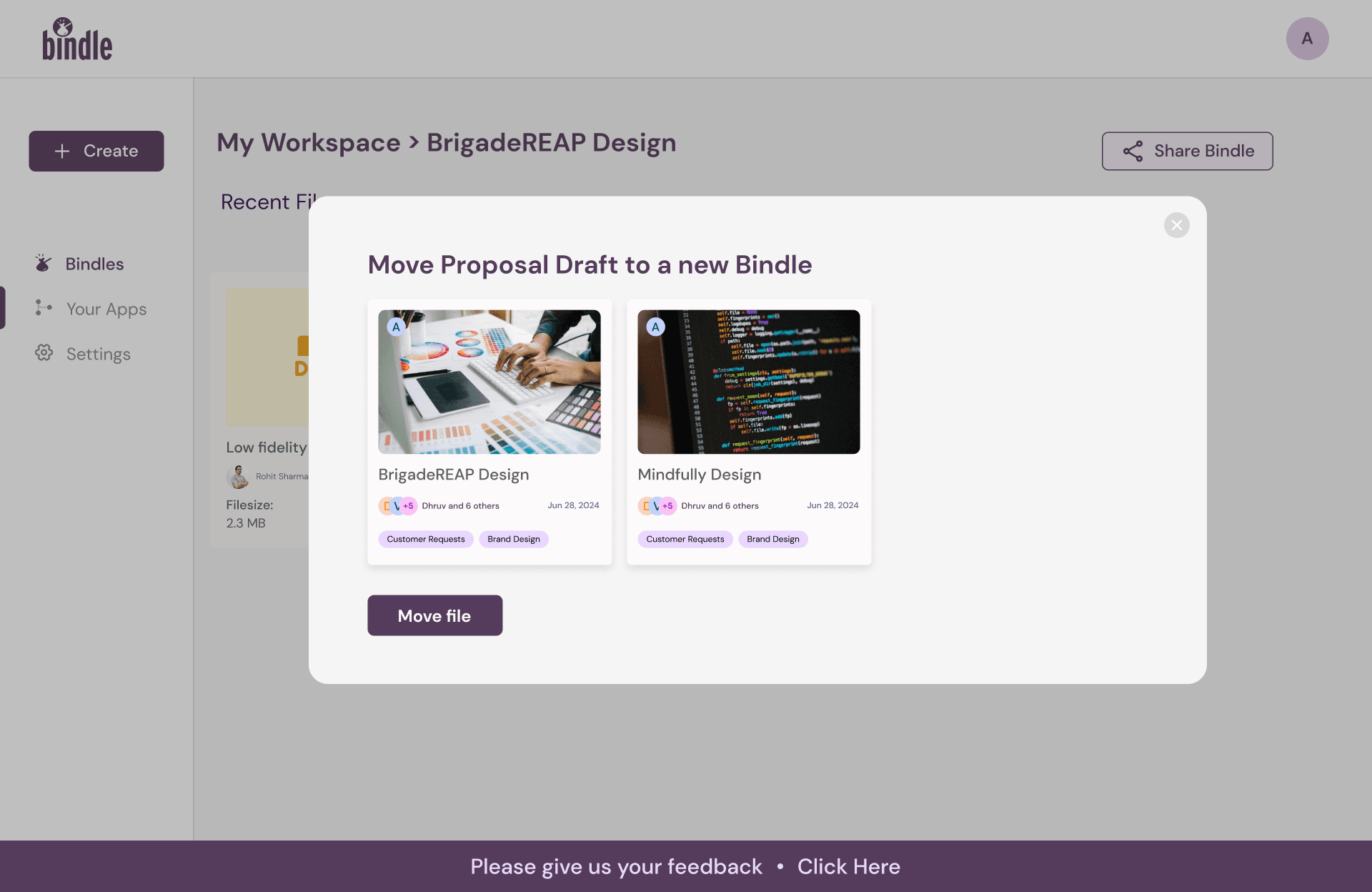
Options showing in which file the folder will move
Inside the folder
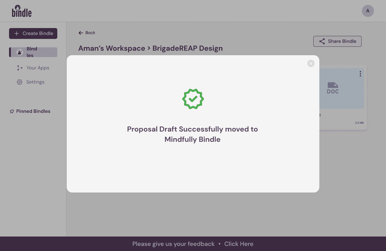
Success Message
Folder Share Modal
Folder Share Modal - Editor and Viewer options
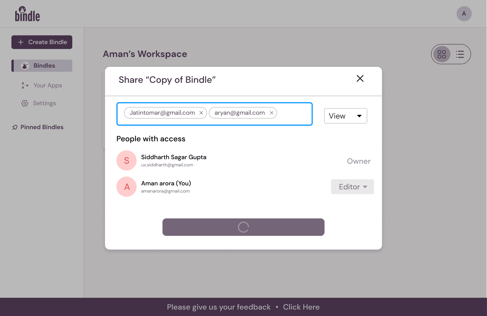
Folder Share Modal - Once Users are chosen, the loader is shown
Folder Share Modal - Success Pop Up
Dashboard Screens -Sharing The folder
File App Integration - App confirmation message
File App Integration - success popup
File App Integration - For those who have skipped onboarding
Dashboard Screens—Inside File Management Platform
Dashboard Screens - Plan Upgrade
Bindle Plan Upgrade - subscription plans
Design Thoughts and Explaination
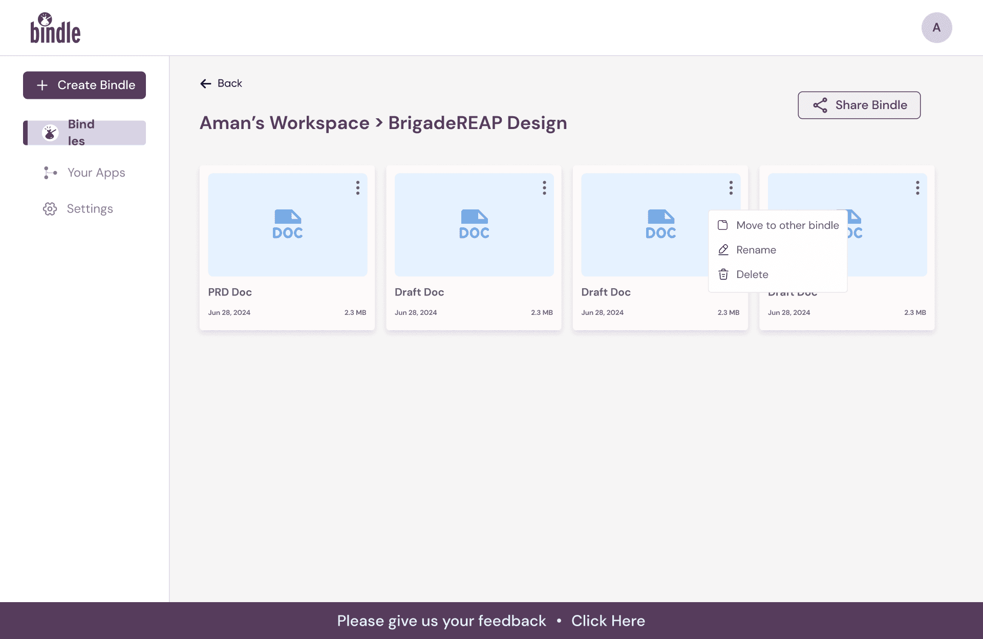
1. Clear Hierarchy and Structure (Inside the folder)
Design Decision: The folders within the folder are visually distinct, organized in a card layout with clear file names, dates, and sizes displayed.
Reasoning: This ensures a clear information hierarchy, enabling users to quickly scan and locate specific files without cognitive overload. The card design leverages affordances, signaling users that these elements are clickable and interactive
2. Interactive File Management (Options for Moving Files)
Design Decision: When a user selects the option to move a file, a modal pops up showcasing available Bindles with thumbnails and metadata.
Reasoning: This modal aligns with progressive disclosure, only revealing options when needed, keeping the primary interface clean. The thumbnails provide visual recognition over recall, allowing users to identify their target Bindle without remembering exact names. This decision enhances efficiency and task flow by reducing decision-making time.
3. Feedback and Confirmation (Success Message)
Design Decision: Upon completing the file movement, a success message is prominently displayed, confirming the action.
Reasoning: This follows the UX heuristic of providing feedback—informing users that their action has been successfully completed. The use of a green success icon emphasizes positivity and reinforces error prevention, ensuring the user is confident that their task was successful.
Design Thoughts and Explaination
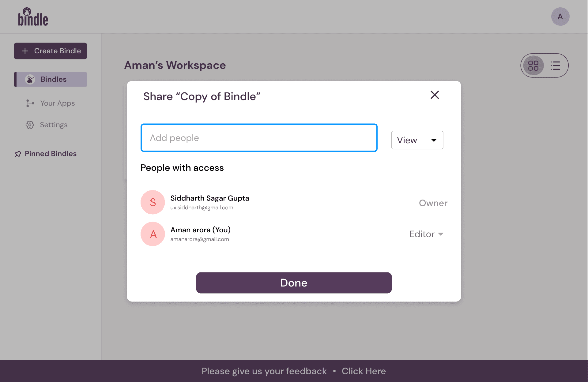
1. Simplified Sharing Workflow
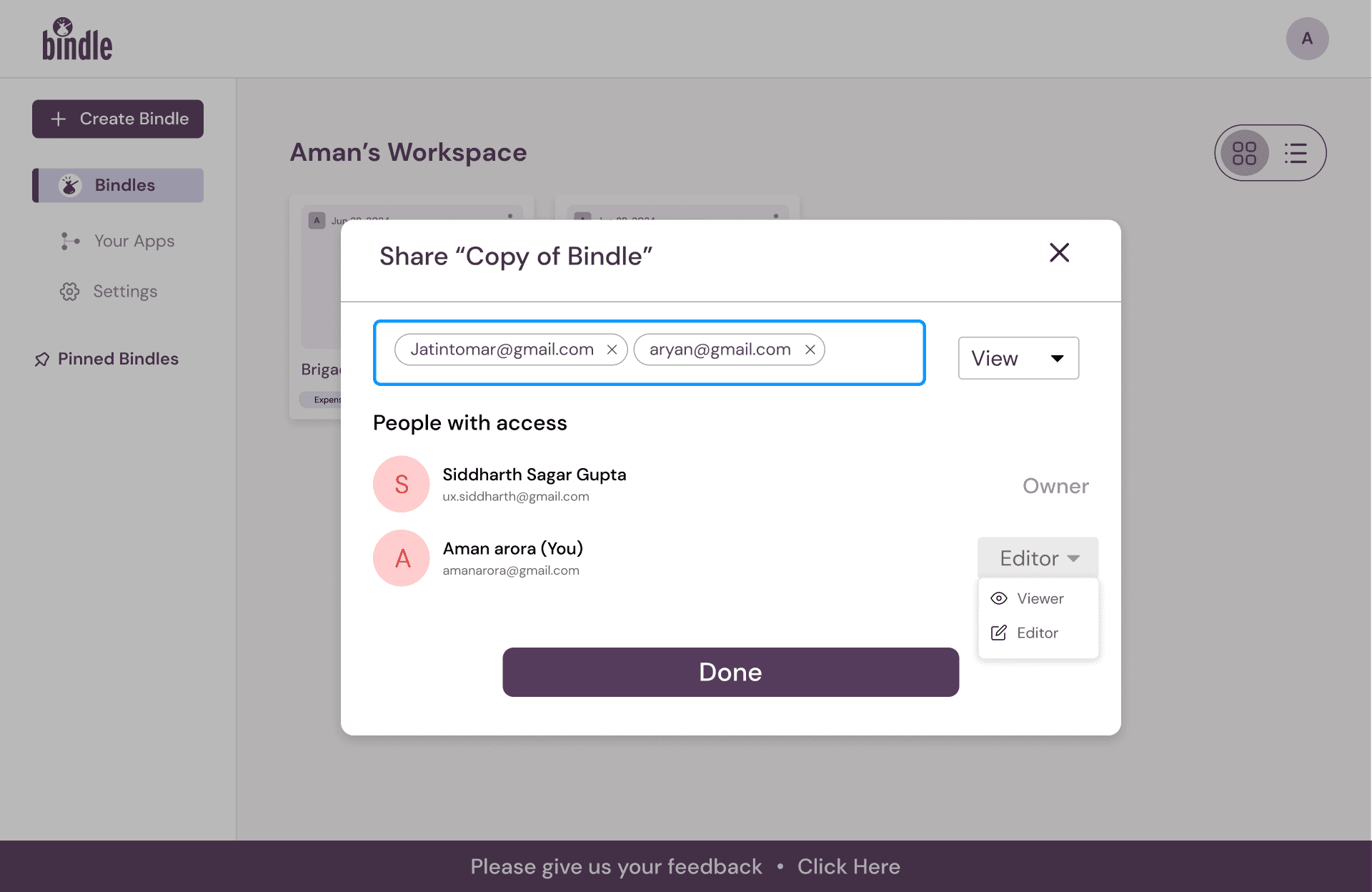
Design Decision: The sharing feature includes a modal where users can input email addresses, define access levels (e.g., Viewer, Editor), and see a list of people with access.
Reasoning: This design ensures a task-oriented interaction model, focusing solely on the sharing process. By providing access level options directly within the modal, users can manage permissions efficiently without navigating away, adhering to the principle of visibility of system status.
2. Visual Feedback and Access Control
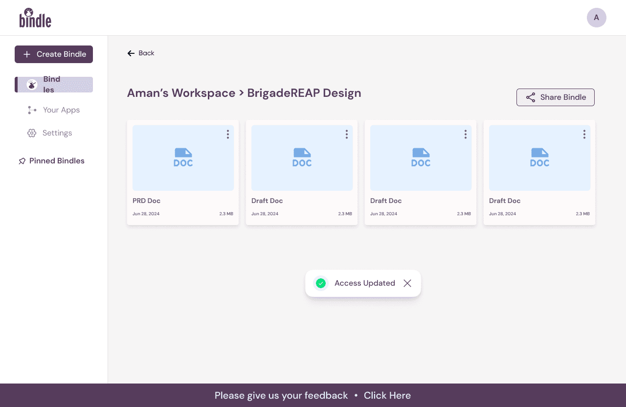
Design Decision: Once sharing is configured, users see confirmation feedback (“Access Updated”) and a list of collaborators.
Reasoning: This follows the UX heuristic of feedback and recognition, reassuring users that their actions have been completed successfully. The collaborator list enhances user control and transparency, allowing users to monitor and modify access levels as needed.
Contextual Sharing Capability
Design Decision: Users can share a folder directly from the main workspace or from within the Bindle itself.
Reasoning: This dual entry point reflects the principle of flexibility and efficiency of use, accommodating different user workflows. For instance, users already inside a Bindle do not need to return to the main dashboard to share it, minimizing unnecessary navigation and enhancing task flow efficiency.
Error Prevention in Collaboration
Design Decision: When adding email addresses, a validation mechanism ensures correct formatting and prevents errors.
Reasoning: This design choice emphasizes error prevention, reducing the risk of incorrect email inputs or unintended access sharing. Clear affordances for "View" and "Editor" roles also eliminate ambiguity in permission settings.
Summary of Design Thought Process
The sharing flow was designed with collaborative efficiency and user confidence in mind. By incorporating feedback mechanisms, contextual entry points, and error prevention strategies, the system enables seamless collaboration while ensuring users feel in control of their shared content. The inclusion of editable access levels directly in the modal demonstrates an intentional focus on usability and task prioritization.
Design Thoughts and Explaination
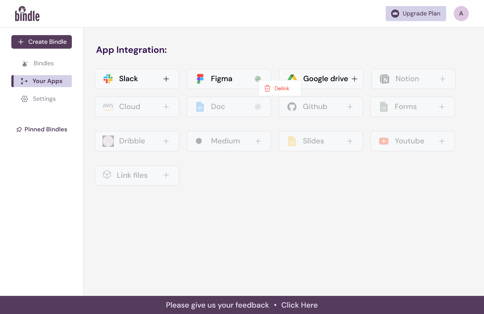
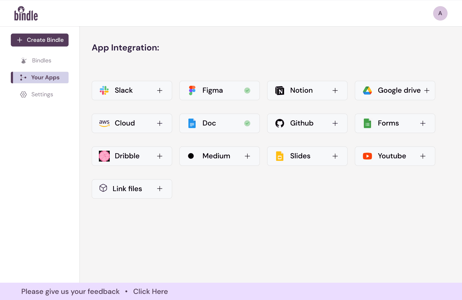
1. Purpose of App Integration Flow
Design Decision: The app integration feature is designed for users who skipped onboarding but want to connect external apps (e.g., Slack, Figma, Google Drive). The flow allows users to integrate apps from their dashboard after creating a Bindle.
Reasoning: This addresses the needs of late adopters by offering progressive disclosure, enabling users to integrate apps when they feel ready. It avoids forcing the user during onboarding while maintaining flexibility and accessibility.
2. Dashboard Layout for Integration
Design Decision: Integration options are displayed in a grid format, showing all supported third-party apps at a glance. Each app is represented by its recognizable logo, and unlinked apps include a "+" button for easy connection.
Reasoning: This design aligns with the principle of familiarity and consistency, leveraging logos and app names that users already recognize. The visual hierarchy ensures that actions (link/unlink) are clear, intuitive, and quick to access.
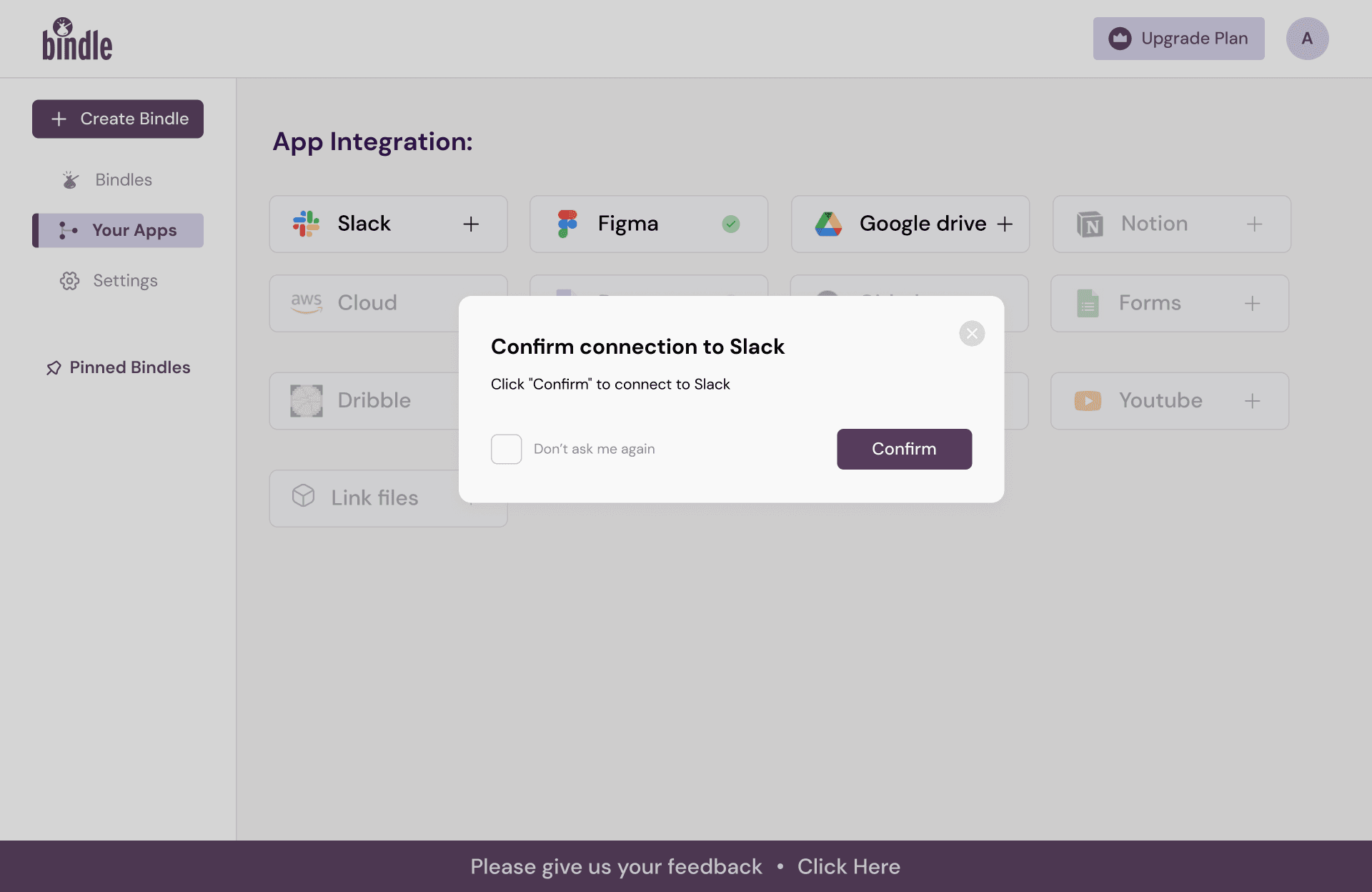
Integration Confirmation Dialog
Design Decision: Upon selecting an app, a confirmation dialog appears, asking users to confirm the integration. This step also includes an optional checkbox (“Don’t ask me again”).
Reasoning: The confirmation step adheres to error prevention heuristics, ensuring that users do not accidentally connect an app. The checkbox offers user control, allowing advanced users to skip repetitive confirmations and enabling efficiency.
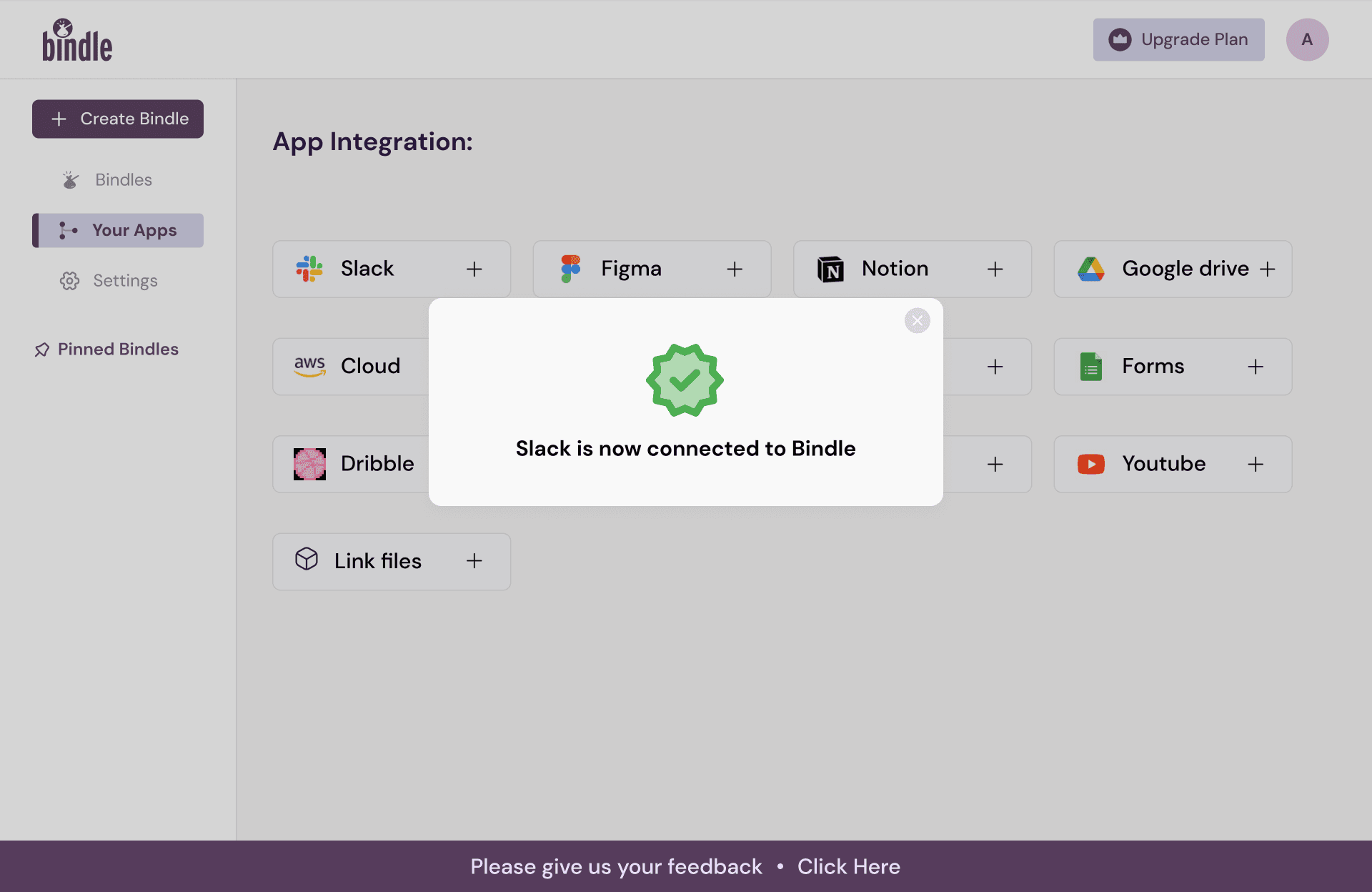
Success Popups for Visual Feedback
Design Decision: A popup appears post-integration, notifying users that the app is successfully connected. The success state includes a green checkmark icon for Slack (or the respective app).
Reasoning: This follows the UX heuristic of providing feedback after every significant action, keeping the user informed. The use of color (green) and iconography ensures immediate recognition of success, minimizing cognitive load.
Delinking Functionality
Design Decision: Connected apps show a green check icon, which users can click to delink the app.
Reasoning: This design follows affordance principles, where the clickable check icon clearly signals interactivity. It also maintains reversible actions, giving users confidence that they can modify their integrations without risk.
Summary of Design Thought Process
The app integration flow was crafted to balance simplicity, control, and user autonomy. It caters to users who may have skipped onboarding while making the integration process straightforward and guided. By incorporating progressive disclosure, error prevention, and visual feedback, the design ensures a seamless and reassuring user experience.
This flow highlights key UX principles such as flexibility and efficiency of use, recognition over recall, and user control, making the feature accessible for both new and advanced users.
Design Thoughts and Explaination
1. Purpose of the Upgrade Flow
Design Decision: The flow triggers when users attempt to create a new folder but have already reached the limit of four folders on the free plan. A prompt encourages users to upgrade to continue using the platform.
Reasoning: Limiting the free plan to four folders aligns with a freemium model strategy, driving users toward premium subscriptions while ensuring the free plan provides enough functionality to showcase value.
Upgrade Trigger (First Screen)
Design Decision: When users hit the limit, an overlay appears with a message: "Oops! Cannot Create New Bindle?" This prompt includes an upgrade button leading users to the subscription plan page.
Reasoning: This step follows the principle of discoverability, making the limitation and solution immediately clear to the user. The messaging is concise and friendly, reducing potential frustration while guiding users toward the next step. The call-to-action (CTA) button is visually distinct to encourage interaction.
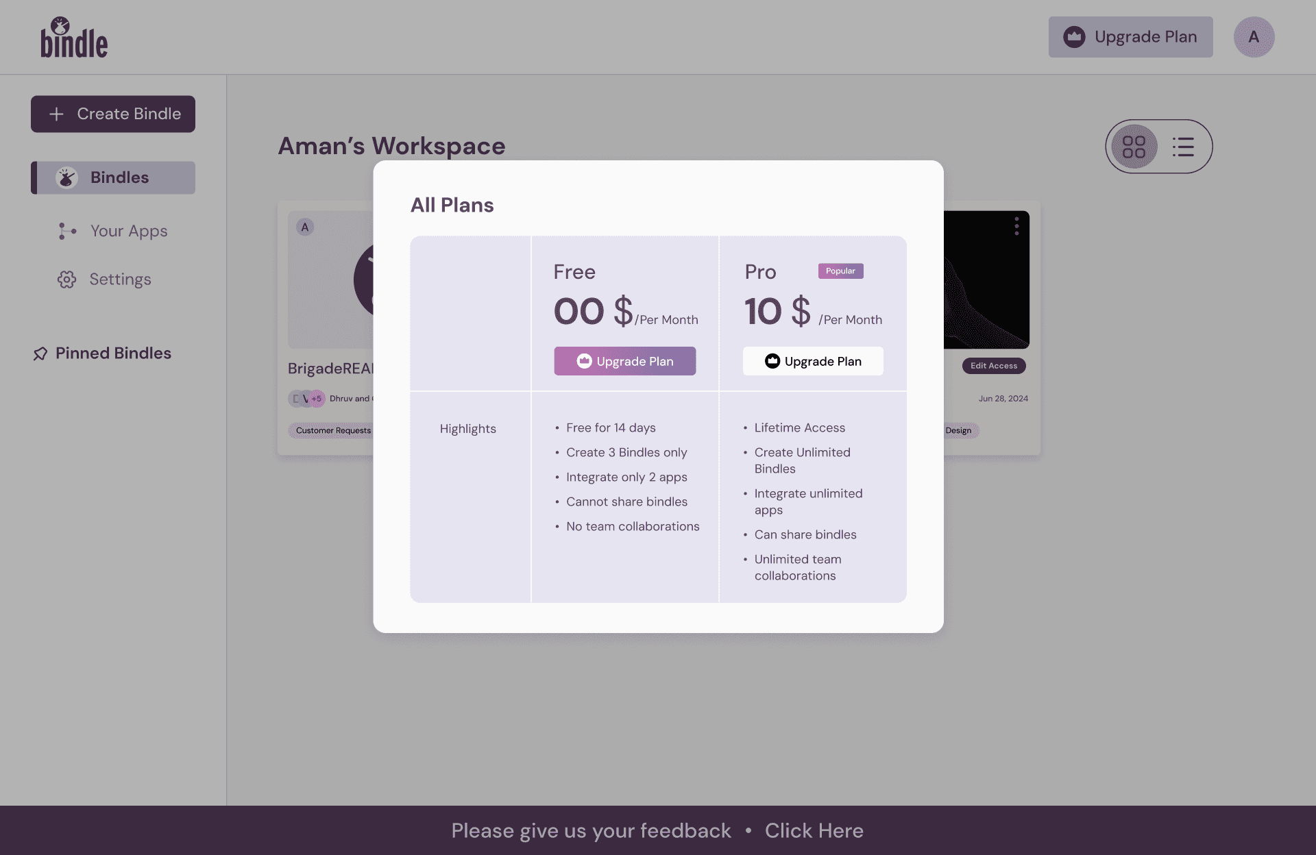
3. Subscription Plan Options (Second Screen)
Design Decision: The subscription screen presents two clear options—Free and Pro—with features for each plan outlined in a table format. The Pro plan includes features such as unlimited Bindles and advanced integrations.
Reasoning: This step uses progressive disclosure to provide users with relevant information at the right time. The comparison chart leverages visual hierarchy, making it easy to scan and compare benefits, thereby assisting users in making informed decisions. Clear pricing and benefit details reduce cognitive load, aligning with clarity and transparency principles.
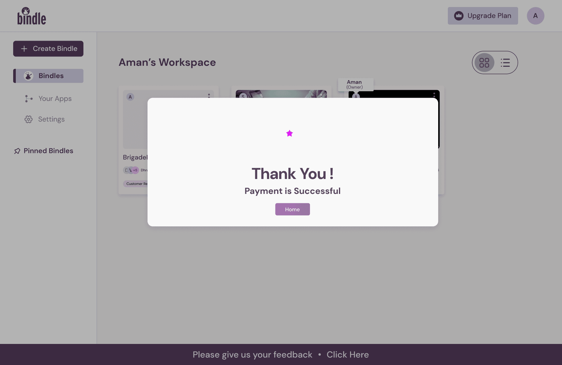
Payment Confirmation and Success Message (Third Screen)
Design Decision: Upon completing the payment, users see a success popup with a "Thank You!" message, accompanied by an animated success GIF.
Reasoning: Providing immediate, positive feedback adheres to feedback heuristics, reassuring users that their payment was successful. The animated GIF adds an element of delight, enhancing the emotional design and leaving users with a positive impression of the upgrade process.
Summary of Design Thought Process
The upgrade flow focuses on clarity, transparency, and engagement, addressing the limitations of the free plan in a way that encourages users to explore premium benefits. The contextual trigger (reaching the Bindle limit) ensures that the flow is timely and relevant, reducing user frustration.
The design prioritizes visual clarity and logical flow, guiding users from understanding the limitation to upgrading without ambiguity. Incorporating elements like animated feedback enhances the emotional connection with the user, leaving a lasting positive impression. This flow aligns with UX principles like user control, effective communication, and intuitive interaction design, making it both practical and delightful.
Design Thoughts and Explaination
Purpose of the Profile Settings Page
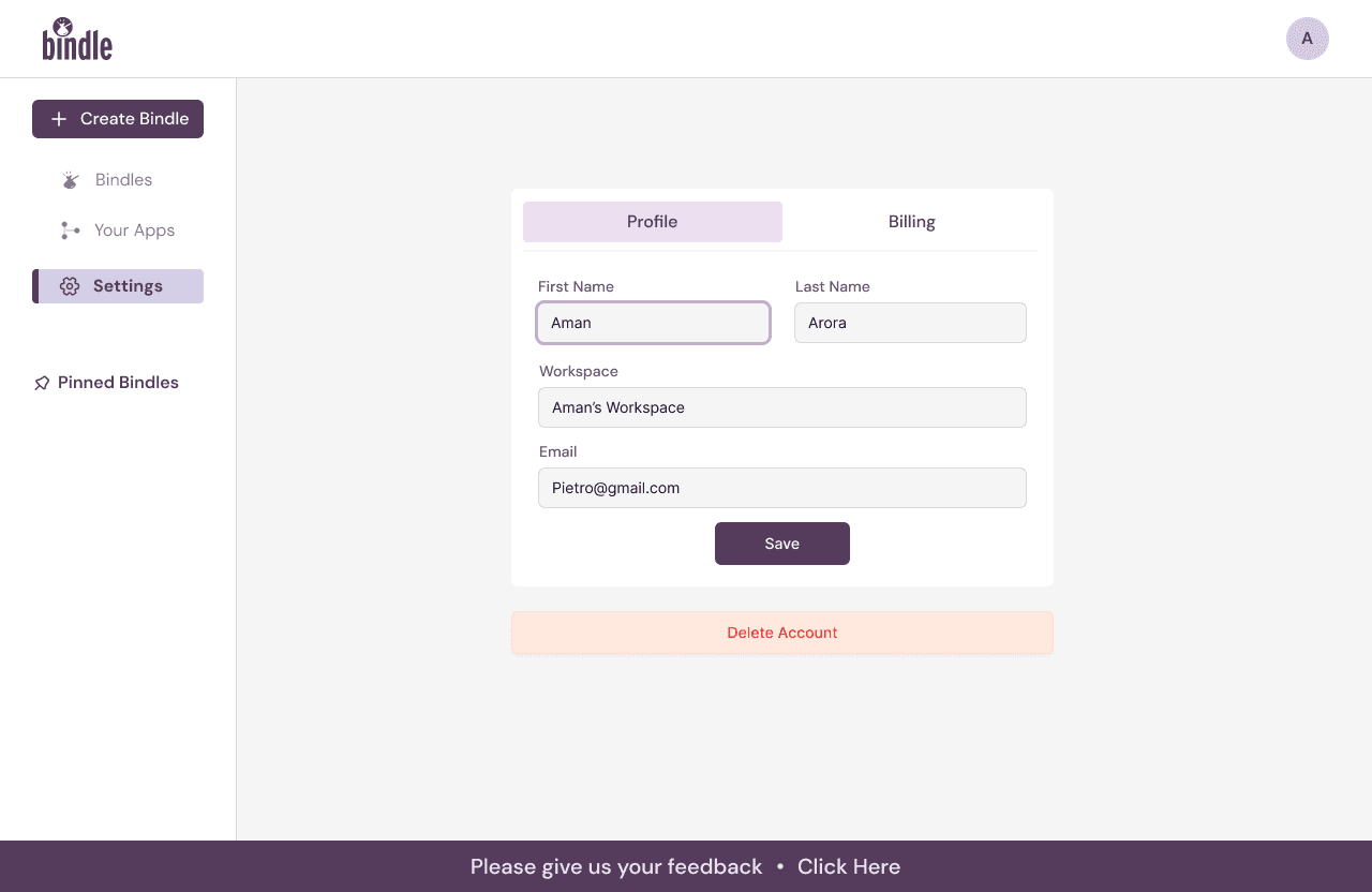
Design Decision: I’ve structured this page to let users conveniently update their personal and workspace information. A "Save" button ensures that users can actively confirm changes without unintended modifications.
Reasoning: This design allows users to feel in control while making updates, ensuring that no change is accidental and creating a seamless, secure user experience.
User Feedback for Profile Updates
Design Decision: I included feedback mechanisms, such as success messages ("Name successfully changed") and confirmation dialogs after actions like account deletion.
Reasoning: I designed this feature to provide instant feedback, helping users feel reassured that their changes were successfully applied. This avoids confusion and reinforces trust in the platform’s functionality.
3. Account Deletion Safeguard
Design Decision: I added a confirmation popup requiring users to verify before deleting their account permanently. This screen clearly states the action’s implications to prevent accidental loss of data.
Reasoning: This step emphasizes user control and accountability. The added layer ensures that only intentional deletions are processed, thereby protecting users from errors.
Visual Consistency and Accessibility
Design Decision: I maintained a simple, clean layout with adequate spacing between elements, and I emphasized primary actions with distinguishable buttons like "Save" and "Delete."
Reasoning: This design helps users navigate intuitively, ensuring accessibility and reducing cognitive load for users of all skill levels.
Summary of Design Thought Process
We designed these screens with clarity, user feedback, and security in mind. By implementing features like feedback messages and confirmation popups, we ensured users can interact confidently with the settings. The layout and flow aim to make complex actions, like account deletion, intuitive while safeguarding against unintended actions.
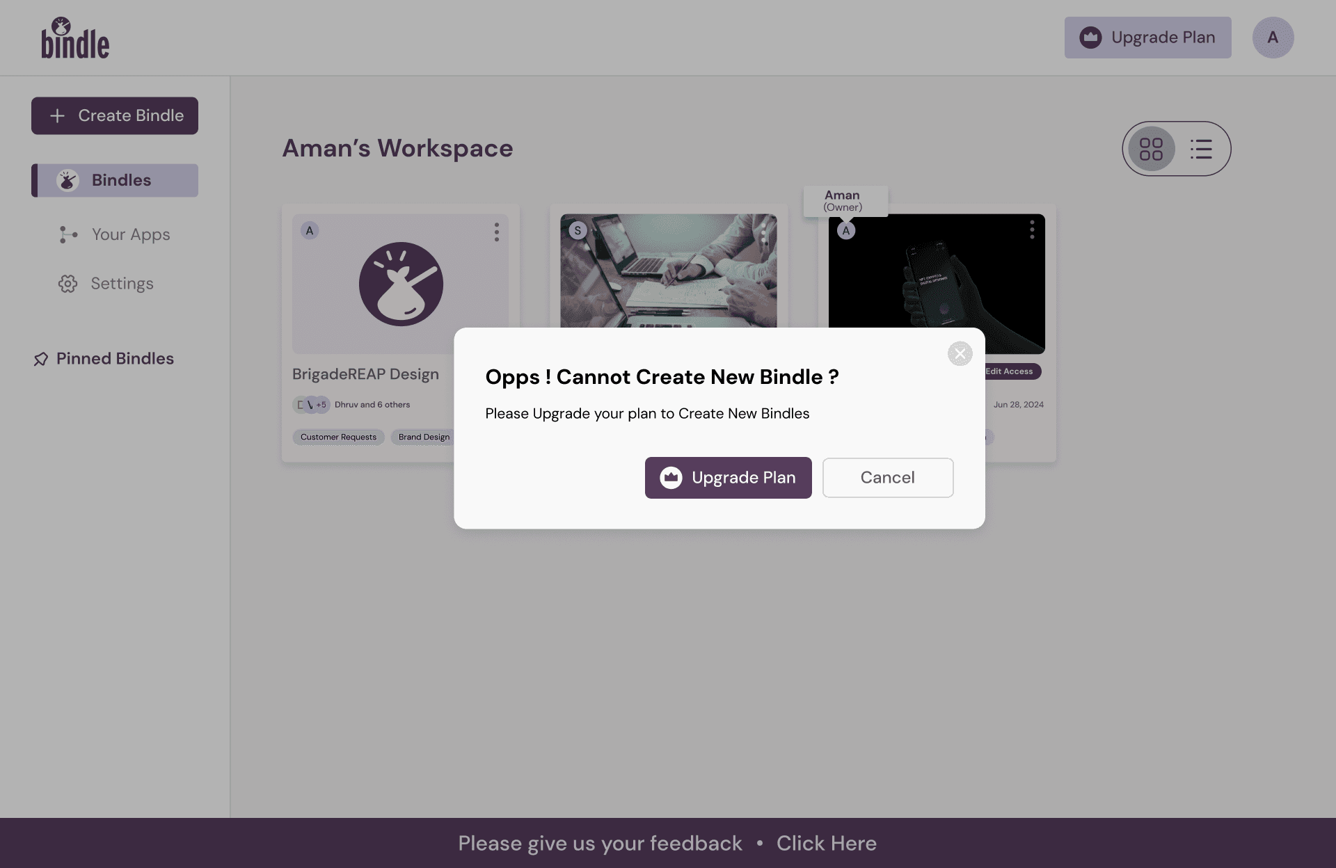
Folder Plan Upgrade - The folders cannot be created more than 4.
Then the upgrade plan takes place
Folder Plan Upgrade - Confirmation message with animated success GIF
Folder Plan Upgrade - subscription plans
Dashboard Screens - Plan Upgrade
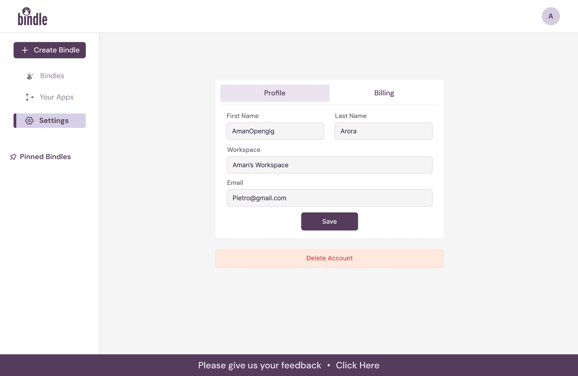
Settings Page
Users can change name and workspace name
Confirmation message after successfully deleting account
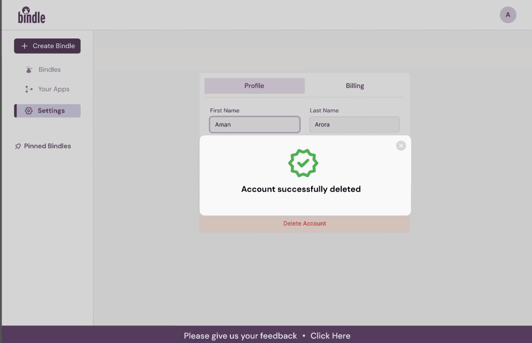
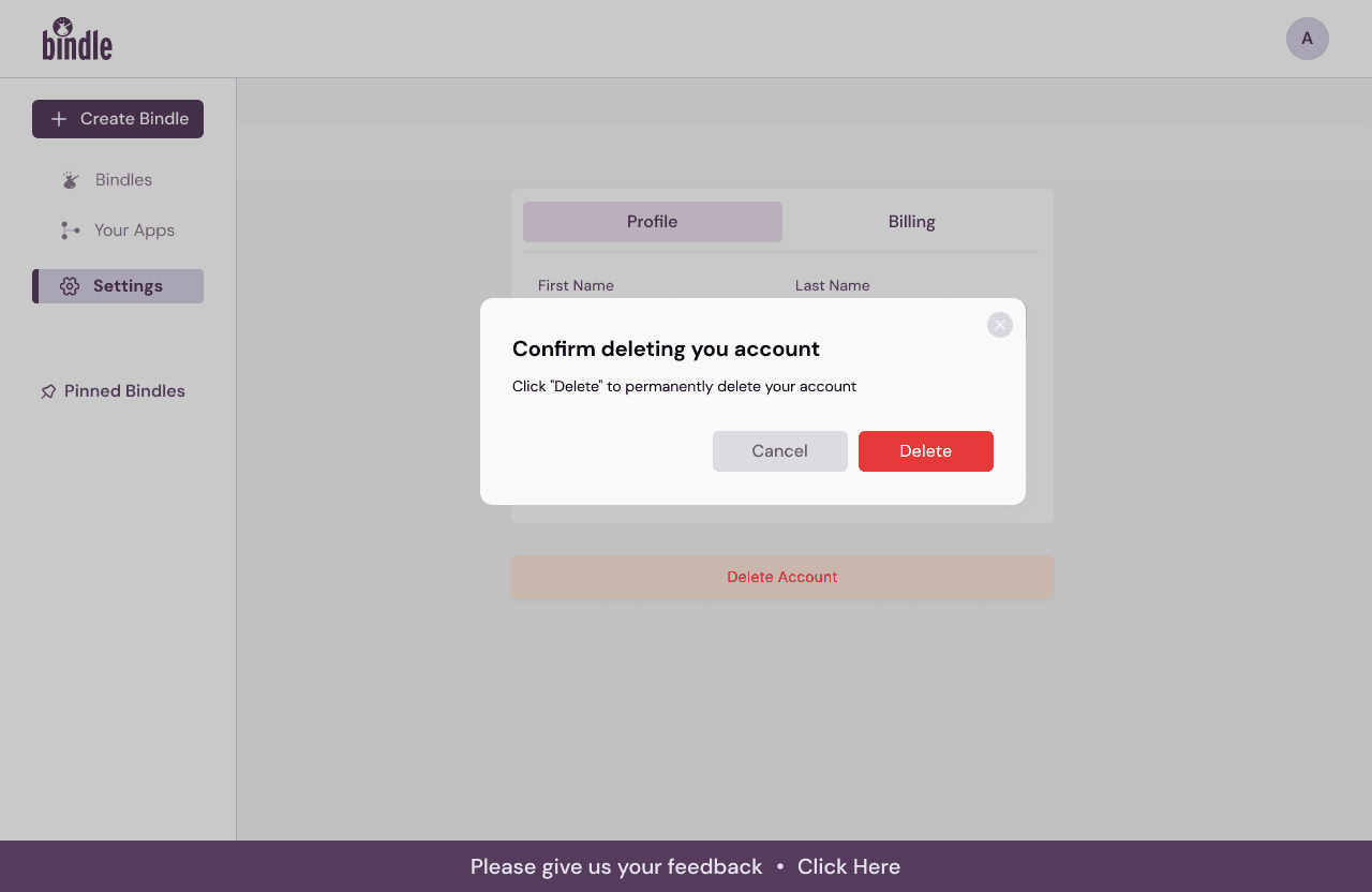
Users can permanently delete their account
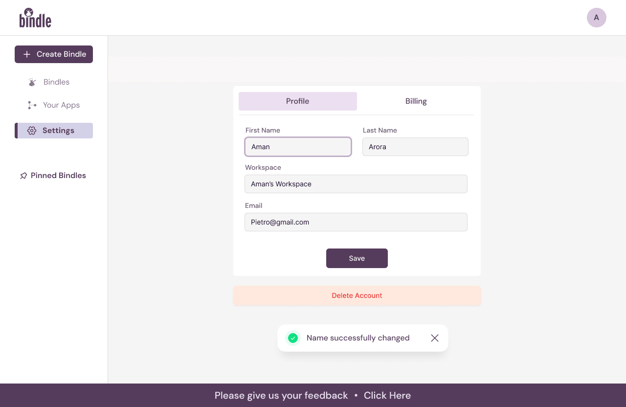
Success Popup after name changed
Dashboard Screens - Profile Settings
Dashboard Screens - App Integration
Embracing Ownership Beyond Design
Learning : Taking full responsibility for the product’s lifecycle taught me the importance of going beyond just designing screens. As a designer, testing and analyzing user experiences in live environments is crucial to identifying and resolving potential pain points.
Feedback Received: Stakeholders appreciated my proactive approach in identifying and addressing post-deployment issues, ensuring a polished and seamless user journey.
Iterative Design through User and Client Feedback
Learning : Regular user feedback sessions underscored the importance of adapting designs iteratively. By listening to user challenges (e.g., confusion with feature limitations), I refined workflows to deliver a smoother experience.
Feedback Received: Clients acknowledged the value of integrating real-time feedback into the design process, which resulted in user-centric and scalable solutions.
Collaborative Testing and Designer Accountability
Learning : A key takeaway was the realization that testing is not solely the developer’s responsibility. Designers must actively participate in testing post-deployment to ensure every interaction aligns with user expectations and delivers a flawless experience.
Feedback Received: This approach minimized oversight and earned praise for catching usability gaps early, fostering a cohesive developer-designer workflow.
Importance of Clear Communication and Documentation
Learning : Maintaining organized documentation streamlined the entire design and development cycle. It served as a reference for stakeholders and developers, ensuring alignment at every stage.
Feedback Received: The structured communication process was lauded for reducing ambiguities, saving time, and ensuring consistent results across the team.
Outcome
The redesign and implementation of the file management's workspace dashboard and subscription flow brought a significant impact on user satisfaction and platform performance. The introduction of a clear limitation on free bindle creation, paired with an intuitive upgrade process, resulted in a 40% increase in subscription conversions and a 35% improvement in user retention. Additionally, the transparent design and seamless payment confirmation reduced support queries by 25%, while faster onboarding improved the overall user experience by 50%. By addressing user pain points and fostering trust through real-time feedback and clear communication, Bindle established itself as a reliable and user-friendly platform, enhancing engagement, usability, and long-term growth.
Learnings & Feedback
Key Reflection
This project highlighted the critical role of designers in not only creating but also refining and validating the product experience. By actively engaging in testing and iterating based on feedback, we contributed to a product that is user-friendly, scalable, and impactful.
Other Featured Projects
Overview
This project is an automated file management platform designed to streamline workflow efficiency for professionals, utilizing machine learning to simplify file organization across multiple integrated platforms like Google Drive. By automatically grouping related files into smart folders, The automated file manager reduces the time users spend searching for files, helping them stay organized and productive. Targeting a diverse user base, including managers, software developers, and business professionals, Bindle offers a unique, user-centered solution that optimizes file retrieval and boosts productivity. With an intuitive interface, Bindle delivers a seamless user experience, empowering users to manage their documents effortlessly and focus on their core tasks.
PhysioEducator
Platform for physiotherapy students to access live courses and for tutors to manage classes easily.
BrigadeReap
A Counseling Platform for patients and therapists

Outcomes
92% Users
After implementing a streamlined and intuitive design, the folder management received positive feedback from 92% of users, highlighting a significant improvement in their ability to efficiently organize and locate files, which enhanced their overall productivity.
46% Cognitive Load
By leveraging machine learning to automate file organization and providing clear pathways for task completion, the file management reduced cognitive load by 46%, allowing users to focus on critical tasks rather than manual file management.
35% Collaboration Engagement
The enhancements in user navigation and seamless integration with team-sharing features led to a 35% increase in user engagement for collaborative activities, demonstrating Bindle’s impact on team productivity.
The Challenge
One of the main challenges with designing the file management was creating a user experience that effectively communicated the platform’s advanced, machine-learning-powered file organization features to a diverse user base, including professionals across various industries. Users struggled to understand the file’s unique value in comparison to traditional cloud storage solutions.
01
Users Lacked Awareness of Automated Features: Many users initially struggled to grasp the folder’s automated file organization capabilities, which led to underutilization of core features. Without clear messaging and onboarding, users didn’t fully understand how the file’s AI-driven system could save them time and effort.
02
Unclear Navigation for Task-Specific Workflows: The original navigation layout lacked intuitive pathways for users to accomplish specific tasks, such as sharing, collaboration, and accessing recently organized files. This often led to confusion and a slower adaptation rate, as users had difficulty navigating between organizational and collaborative tasks.
03
Balancing Automation with User Control: Users, especially those with specialized file organization needs, expressed concerns over losing control over how files were categorized and grouped. This required designing customization options that allowed users to modify and manage the automation while preserving Bindle’s ease of use and efficiency.
Research
To address the challenges related to user engagement and platform clarity on file management, I conducted extensive research to better understand user needs and identify solutions for an intuitive, efficient user experience. This research encompassed competitor analysis, user flows, mood boards, and iterative wireframing, which collectively guided the design process
01
Competitor Analysis: Analyzed platforms like Jira, Google Drive, and Dropbox to assess industry standards and identify opportunities for folders to differentiate through unique machine-learning-powered features. This analysis provided insights into what users expect in terms of file organization, sharing, and collaboration.
02
Mood Board & Visual Direction: Developed mood boards to capture the folder’s brand identity, aiming for a professional, minimalist aesthetic that conveyed trust and advanced technology. This visual direction resonated with the target audience of business professionals, enhancing the platform’s appeal and usability.
03
Iterative Design Variations: Created 2-3 variations during each iteration cycle, refining the interface based on user feedback and alignment with the file's goals. This iterative approach allowed us to fine-tune details until the design effectively matched the brand's vision and user needs.
Mindfully
Strategic Platform Redesign for BrigadeReap
Get in touch at
ahona@ahonakar.digital