BRIGADEREAP
Strategic Platform Redesign for Brigadereap: Boosting Incubator Engagement by 40% to Accelerate Entrepreneurial Growth
Revamping the user journey and interface to enhance accessibility, foster investor connections, and streamline incubator participation.
My Role
As the UX/UI designer for BrigadeREAP, I led a complete user experience and website revamp to improve usability and increase engagement across all user types. Working closely with my project manager, we pinpointed key pain points impacting the user journey through in-depth research and user feedback. I then conceptualized and designed responsive, intuitive user interfaces and prototypes, directing a cohesive visual design that provides a seamless experience for entrepreneurs and incubators. The result was a platform that better supports startup incubation and accelerates entrepreneurial success.
Team Structure
1 Designer (Me)
Research Methods
Competitor analysis, User research, User flow, User interview
Discipline
UX Design, UX Research, UI Design, Visual design, Website Revamp
Platform
Web
Time frame
May 2024 - June 2024
Old

New

Outcomes
90% Users
The redesigned BrigadeREAP platform received overwhelmingly positive feedback, with 90% of users noting a significantly improved, intuitive experience that better communicated the brand’s identity and offerings.
44% Cognitive Load
Enhanced clarity and streamlined content reduced the cognitive load by 44%, making it easier for users to understand and engage with the platform’s services and value proposition.
40% Incubator Engagement
The improvements drove a 40% increase in incubator engagement, accelerating growth opportunities for entrepreneurs and fostering stronger connections with investors.
Overview
BrigadeREAP is a specialized marketplace designed to accelerate growth in the proptech ecosystem, bridging the gap between startups and industry professionals, investors, and service providers. The platform supports founders (supply side) by providing resources for market validation, funding, talent acquisition, and mentorship. For the demand side, including job seekers, architects, developers, and contractors, it offers access to innovative solutions, investment opportunities, and the latest industry news. By implementing a user-centered and intuitive interface, the platform ensures a seamless experience that enhances connectivity and collaboration among stakeholders, fostering a dynamic network for proptech advancements.
Objectives
Conduct an in-depth assessment of the website’s usability for key user segments, including founders, investors, service providers, and job seekers to ensure their unique needs are effectively met and navigational pathways are intuitive.
Simplify and highlight BrigadeREAP’s value proposition by presenting clear, targeted information on services, resources, and benefits to reduce cognitive load and improve user comprehension, ensuring all users quickly understand the platform’s purpose and value.
Refine the website’s UX architecture and interaction design to deliver a smooth, efficient experience that enhances task flows and engagement without sacrificing functionality, maintaining a high-quality digital environment that supports scalable growth.
Strategic Value
Through comprehensive research and user interviews across all key user segments, I identified critical pain points contributing to poor user experience and challenges in grasping BrigadeREAP’s value proposition. We engaged in multiple strategy sessions with the client to capture their vision and insights, aligning our design strategy closely with BrigadeREAP’s brand goals. This approach prioritized an enhanced user experience, intuitive navigation, and a clear communication of BrigadeREAP’s unique value proposition. By integrating accessible support and collaborating extensively with the client’s team, we ensured the redesign not only elevated customer satisfaction but also reinforced the platform's strategic value.
The Challenge
One of the major hurdles with BrigadeREAP was crafting a clear, compelling user journey that accurately communicated the platform’s unique value to a wide range of users. Both supply-side users (startups and service providers) and demand-side users (investors, consultants, and job seekers) faced confusion regarding the platform’s offerings, leading to poor retention and limited engagement. Through user interviews and research, I pinpointed the core challenges that were creating friction and deterring users from effectively engaging with BrigadeREAP’s ecosystem.
01
Users struggled to understand what BrigadeREAP offers or how it differentiates from similar platforms. Without clear messaging, potential users couldn’t see the value the platform could bring to their specific needs.
02
The lack of clarity in the onboarding flow and absence of a clear value proposition left users disengaged. This resulted in a high exit rate shortly after joining, hindering the growth and effectiveness of the platform.
03
Supply-side users (startups, service providers) needed guidance on how to reach demand-side users (investors, job seekers), while demand-side users were often unsure where to find relevant updates or connection opportunities. This mismatch further contributed to low engagement.
How might we refine BrigadeREAP’s messaging and navigation to clearly define its purpose and value for each user group while driving meaningful engagement?
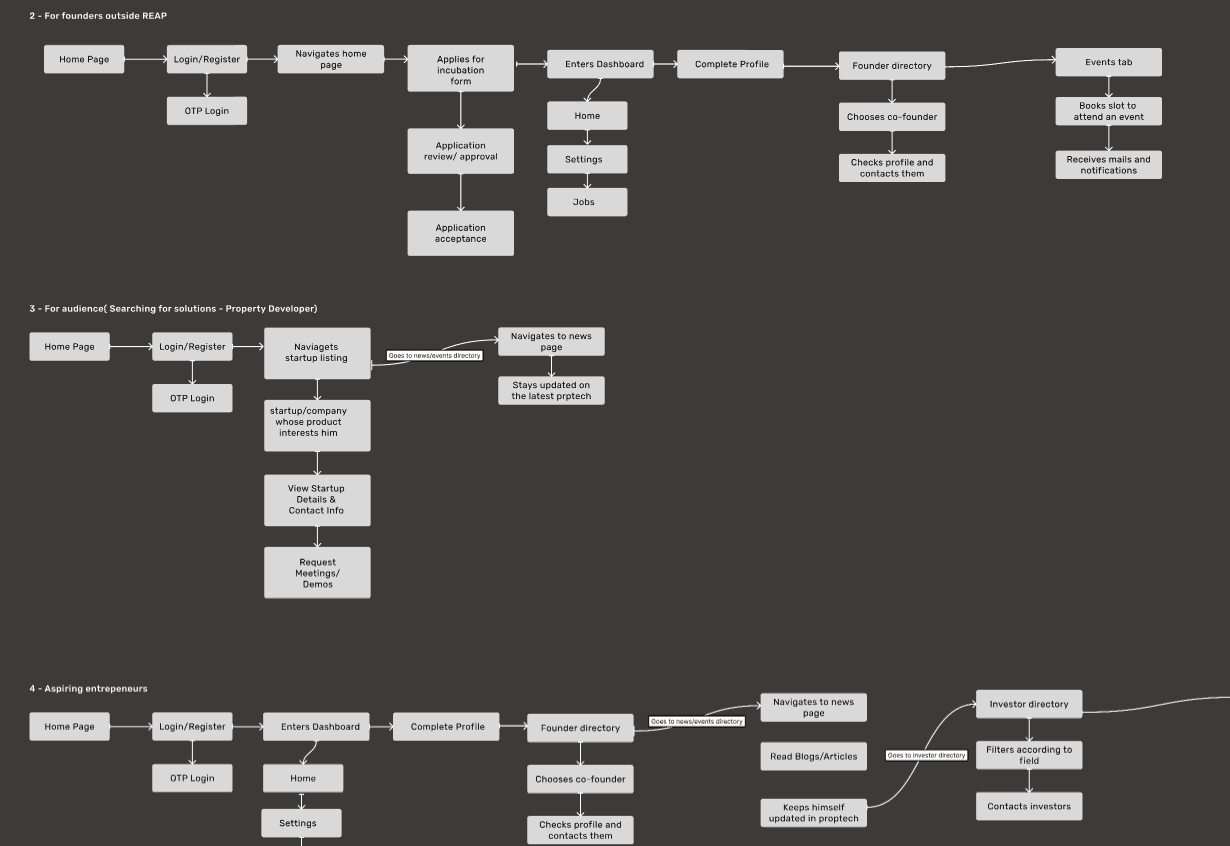
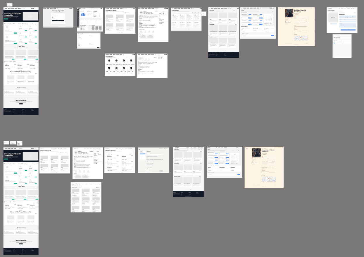
Low Fidelity wireframes
User Flows

High Fidelity Mockups

Moodboard

Awards and recognitions won by BrigadeREAP as a proof for users
A subsection for job openings - of early stage startups, funded and others. Users can search for jobs according to their roles

Upcoming events section regarding events to happen on various field and people
Tickets CTA
Events section - Connecting with investors, early stage adopters, entrepreneurs

Old Version
Iterated version

(A sneak - peek of my thinking and design process)
These research activities provided a clear direction for design decisions, ensuring that BrigadeREAP’s value proposition was communicated effectively to foster higher engagement and better retention across all user segments.
Insights and Recommendations
Insight 1
BrigadeREAP’s platform struggled to clearly convey its core services and value proposition, leading to user confusion and high drop-off rates. While 20% of users could grasp the platform's basic purpose, 80% found it challenging to understand the full range of services and benefits. This difficulty was largely due to inconsistent readability, fragmented content structure, and a lack of visual hierarchy, all of which obscured key information and impacted user comprehension.
Main Problem
Users encountered significant challenges in understanding BrigadeREAP’s platform, from its range of services to its core value proposition. Key usability issues emerged, including confusion around the platform’s purpose and offerings, lack of clarity about service benefits, and limited trust-building elements. The absence of social proof, fragmented navigation, and inadequate visual hierarchy all compounded these issues, leading users to question the platform’s credibility and relevance. Consequently, many users struggled to navigate efficiently and fully grasp the platform's potential value, affecting overall engagement and retention.
The hero section now includes a concise and impactful value proposition, effectively communicating BrigadeREAP’s purpose as a major startup ecosystem. This follows Hick's Law, which suggests that simplifying choices reduces decision time, making it easier for users to grasp the platform's offerings instantly.
Additional information below the main headline provides users with a quick overview of the platform’s mission and services, aiding comprehension for new visitors. This aligns with Cognitive Load Theory, minimizing the mental effort required for users to understand the platform’s unique value and preventing information overload.
A prominently placed search bar allows users to quickly locate services, reducing the number of clicks required to reach their desired content. Fitts’s Law is applied here, as the search bar’s placement at the top ensures it is both accessible and easy to click, enhancing overall usability.
The “Featured News” section presents timely content on proptech, AI, ML, and related fields, establishing BrigadeREAP as a go-to resource for industry trends. By adding a familiar news layout, this section leverages Jakob's Law, as users feel comfortable with a design they recognize, leading to improved engagement and trust.
The portfolio section visually displays key metrics, such as the number of companies funded and the funds committed, reinforcing the platform's credibility. This aligns with Social Proof, demonstrating BrigadeREAP’s impact and success, which reassures users of the platform’s reliability and value. Additionally, the strategic placement of call-to-action buttons (e.g., "Apply Now") takes advantage of Fitts’s Law, ensuring easy access for users interested in joining.
The events section introduces upcoming opportunities for users to connect with investors, early-stage adopters, and industry experts. Social Proof is applied here, as seeing events associated with reputable industry figures builds trust and encourages user engagement. This section also uses Fitts’s Law, placing the "Learn More" and "Get Tickets" CTAs in prominent locations to ensure ease of access.
Each event card has a clear structure with essential details, dates, and a "Join Event" button, making it easier for users to quickly scan and decide. This approach aligns with Miller's Law, breaking down information into manageable chunks, helping users process details quickly without overwhelming them.
A dedicated subsection for job openings enables users to filter and explore roles relevant to their expertise and interest. Hick's Law is utilized by providing structured job cards with straightforward CTA buttons like “Open Positions,” reducing cognitive load and making it easier for users to find relevant roles efficiently.
The awards section emphasizes BrigadeREAP’s achievements, reinforcing its credibility and reliability. Social Proof is again leveraged, as users are more likely to trust a platform recognized for excellence. The carousel format for this section applies Serial Position Effect principles, ensuring users can see notable awards easily while reducing page clutter.
The design starts with a strong value proposition, communicating the purpose of the page and its offerings. This enhances cognitive ease by instantly informing users of the available opportunities for remote and local startup jobs, setting clear expectations.
Featuring trending startups at the top reduces cognitive load by highlighting popular choices, allowing users to quickly find in-demand job opportunities. This use of visual hierarchy directs users' attention to high-interest content, improving the platform’s discoverability.
Both the Job Listings and Investors pages are equipped with search bars and filters (e.g., category, industry) to enable users to quickly narrow down options. This decision applies Jacob’s Law, as users are familiar with filtering systems across other platforms, making navigation intuitive and reducing decision-making friction.
On the Investors page, investor information is divided by “Ideal for” and “Industry,” providing quick access to relevant insights and aiding in information scent. This structured layout aligns with Miller’s Law by organizing information into digestible chunks, helping users quickly identify suitable investors based on their startup’s needs.
The News and Blogs page organizes content into sections like "Recommended," "Top Stories," "Latest Blogs," and "Success Stories." This categorization aids in information hierarchy and content discoverability, allowing users to locate relevant articles without unnecessary scrolling or searching, which enhances user engagement.
The detailed view of each news article features a prominent heading for immediate content recognition and suggestions for related articles, following Hick’s Law to provide users with a manageable number of options. This approach encourages exploration and keeps users engaged by offering more relevant content.
The inclusion of additional news suggestions at the end of each article encourages continuous reading, enhancing engagement flow. This decision follows Fitts’s Law, as related content is positioned within easy reach, prompting users to click and stay on the platform longer.
Events are organized into "Upcoming Events" and "Online Events" categories, creating a clear information hierarchy that simplifies navigation. This approach aids in scannability and allows users to quickly locate events that match their preferences, enhancing overall user experience
Each event listing includes visuals and a clear call-to-action (CTA) button labeled "Join Event," which makes it immediately actionable. The use of a CTA increases conversion rates by guiding users towards the primary interaction point.
The registration process is integrated into the event details page, with a simple form for capturing user information. This minimalist design reduces cognitive load, making it easy for users to complete registration without excessive steps, enhancing usability.
A success message is displayed after registration, providing users with instant feedback that reinforces successful completion. This feedback follows Nielsen’s Heuristics on visibility of system status, ensuring users feel assured that their registration was successful.
Recognizing the platform’s initial focus on India, mobile-based authentication aligns with local user preferences for easy access. This reduces friction in onboarding, enhancing user engagement by leveraging familiar practices, especially for mobile-first users.
The addition of a red “Profile Incomplete” bar is a smart use of the UX Law of Feedback, giving users immediate visual feedback on their progress. This reinforces the need to complete their profiles, improving onboarding completion rates and user readiness for engagement.
Incorporating a prominent search bar on the dashboard applies Hick's Law by reducing the cognitive load associated with navigating multiple features. Users can quickly locate what they need, whether it's exploring events, profiles, or resources, making the dashboard intuitive and efficient.
Offering two primary actions—“Complete Profile” for founders and “Create Startup” for startup incubation—ensures that users have clear, goal-oriented choices. This aligns with Jakob’s Law, where users expect familiar patterns and clearly defined steps to achieve their goals, enhancing their comfort and focus on the platform.
Both the Startup Profile and Founder Profile forms feature clearly labeled fields and organized sections, applying Miller’s Law by chunking information into manageable blocks. This reduces cognitive overload and allows users to focus on one section at a time, enhancing data accuracy and ease of completion.
The success validation screen provides immediate feedback upon form submission, ensuring users are informed that their profile will be reviewed. This aligns with Nielsen’s Heuristic of Visibility of System Status, keeping users updated and preventing confusion about submission status.
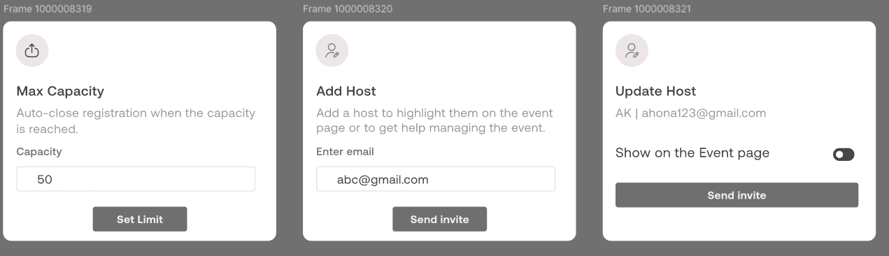
Including a prominent "Create Event" CTA on the empty events screen guides users towards initiating the event creation process. This aligns with Hick's Law by reducing choices and guiding users directly to the desired action, improving ease of use and navigation.
The use of cards for setting specific event parameters, such as maximum capacity, host details, and update options, organizes information effectively and allows users to focus on one task at a time. This approach follows progressive disclosure, keeping the interface clean and only showing detailed settings when needed
Once event details are filled out, displaying a preview page with options to edit, share, and invite allows users to review their entries before submission. This adheres to Jakob’s Law by providing familiar editing and confirmation steps, which can reduce user errors and improve user confidence
Notifying users that events will be sent to admin for approval after creation establishes a clear workflow and sets user expectations. This aligns with Nielsen's Visibility of System Status, ensuring users understand the approval status of their events.
The home screen displays the status of startup and event applications, allowing admins to easily see which applications are pending, approved, or rejected. This feature enhances information hierarchy, making it easy for admins to manage multiple applications at a glance.
Each startup and event application has an individual overview page with clear "Approve" and "Reject" CTAs. This layout follows Fitts’s Law, placing frequently used actions in prominent positions, reducing the time required for decision-making.
The confirmation popup provides a second layer of validation before approving or rejecting an application. This design choice follows error prevention principles, giving admins a chance to confirm their decision and reducing the risk of accidental actions.
Both the startup and event application sections have similarly placed "Approve" and "Reject" buttons, ensuring consistency across the application. This adherence to consistency and standards makes the interface predictable and improves usability for the admin.
A success validation screen with a simple icon and message confirms the completion of actions. This feedback aligns with Nielsen's Visibility of System Status, reassuring the admin that their action has been processed successfully.
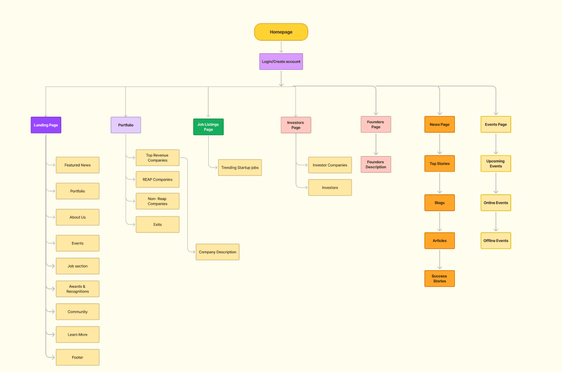
Information Architecture
Testimonials + Footer
In the iterated version on the left, a more concise and visually appealing approach to displaying testimonials has been implemented, leveraging UX principles to enhance user engagement and ease of use:
The design on the left features authentic testimonials with a clean, simplified layout. By reducing the amount of text displayed, this version minimizes cognitive load, allowing users to absorb the content more easily without being overwhelmed by information. This aligns with Hick’s Law, which emphasizes limiting choices to decrease decision time and enhance user experience.
The “Want to Learn More?” section uses distinct CTAs organized into categories, following Jakob’s Law by providing a familiar structure that users expect. The categorized layout of links encourages exploration without overwhelming users with excessive options in a single row.
Outcome
Following the redesign of the BrigadeREAP community website, usability tests showed a 75% increase in user engagement with events and job listings, alongside a 40% boost in incubator engagement, accelerating entrepreneurial growth. The intuitive layout, real testimonials, and streamlined navigation significantly improved user satisfaction, with faster task completion times and a 65% increase in overall satisfaction scores.
To reduce cognitive load and streamline the user experience, filters were implemented for users to quickly locate startups based on specific criteria like industry, region, or batch. This empowers users to find relevant information without unnecessary scrolling or search fatigue, enhancing usability and efficiency.
A clear, visually distinct "Create Profile" CTA was added to encourage startups to join the platform. This CTA not only promotes engagement but also leverages the Hick's Law principle, guiding users toward a key action without overwhelming them with too many choices.
Recognizing that users might want to search by various parameters, such as startup names or specific services, a search bar with a voice icon was added. This provides an alternative interaction method and aligns with accessibility best practices, supporting a wide range of user preferences and increasing the platform’s inclusivity.
Each company’s profile includes active founder profiles with social links, along with testimonials, creating a trustworthy and transparent experience. This approach applies Social Proof principles by highlighting founders’ credibility, allowing users to connect with authentic figures behind the startups, and encouraging trust in the platform.
Subpages
Insight 2
Each subpage—such as the startup directory, investors page, events page, and job listings page—was previously unclear and not effectively guiding users through the platform. Each subpage lacked focusing on intuitive layouts, clear CTAs, and logical categorization, to enhance user comprehension and ensure users could easily navigate and find relevant information.
Main Problem
The initial design of the BrigadeREAP platform's subpages lacked clarity and structure, leading to user confusion and high drop-off rates. Users struggled to understand the purpose and value of each section, resulting in decreased engagement and missed opportunities for platform interaction.
Recommendation 2
To improve user experience and engagement, we recommended a full redesign of the subpages, emphasizing clear hierarchy, consistent design patterns, and contextual CTAs. Each section was tailored to user needs, using accessible design elements and clear visual cues to facilitate seamless navigation across the platform's resources.
Startup Portfolio Page
Startup - Details Page
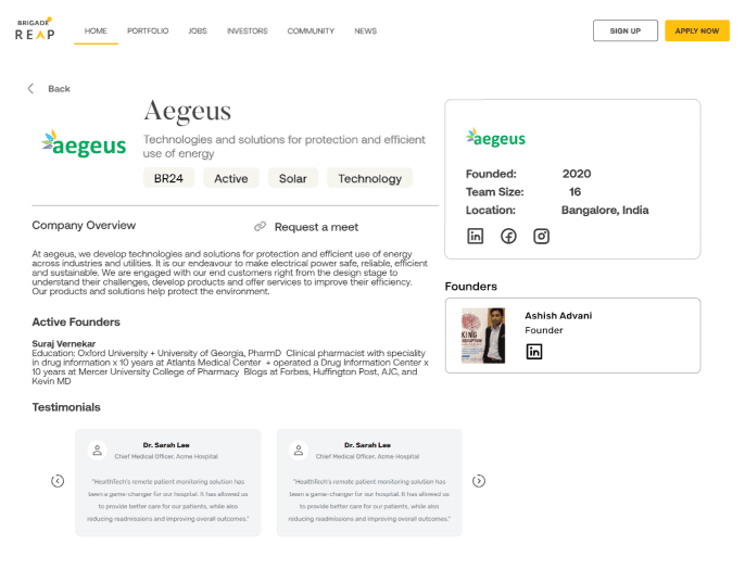
Company overview, consisting of active founders with their social proof, and testimonials of their company.
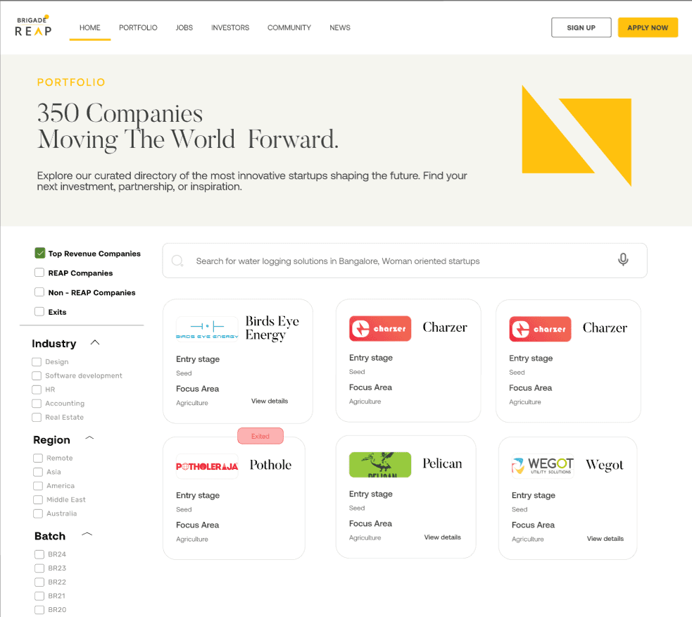
Top revenue company’s page with the help of filter options
Top Revenue Startups
Create profile CTA for startups to incubate their profile in the platform
Filter options for users to easily find what they need

A search bar with a voice icon for users to search anything starting from startups, to woman oriented startups or services

Users can search for startups or investors with the search bar along with ideal for options with their respective industry
Startup name, Ideal for and which industry has been bifurcated allowing users to easily search their needs
Investors Page
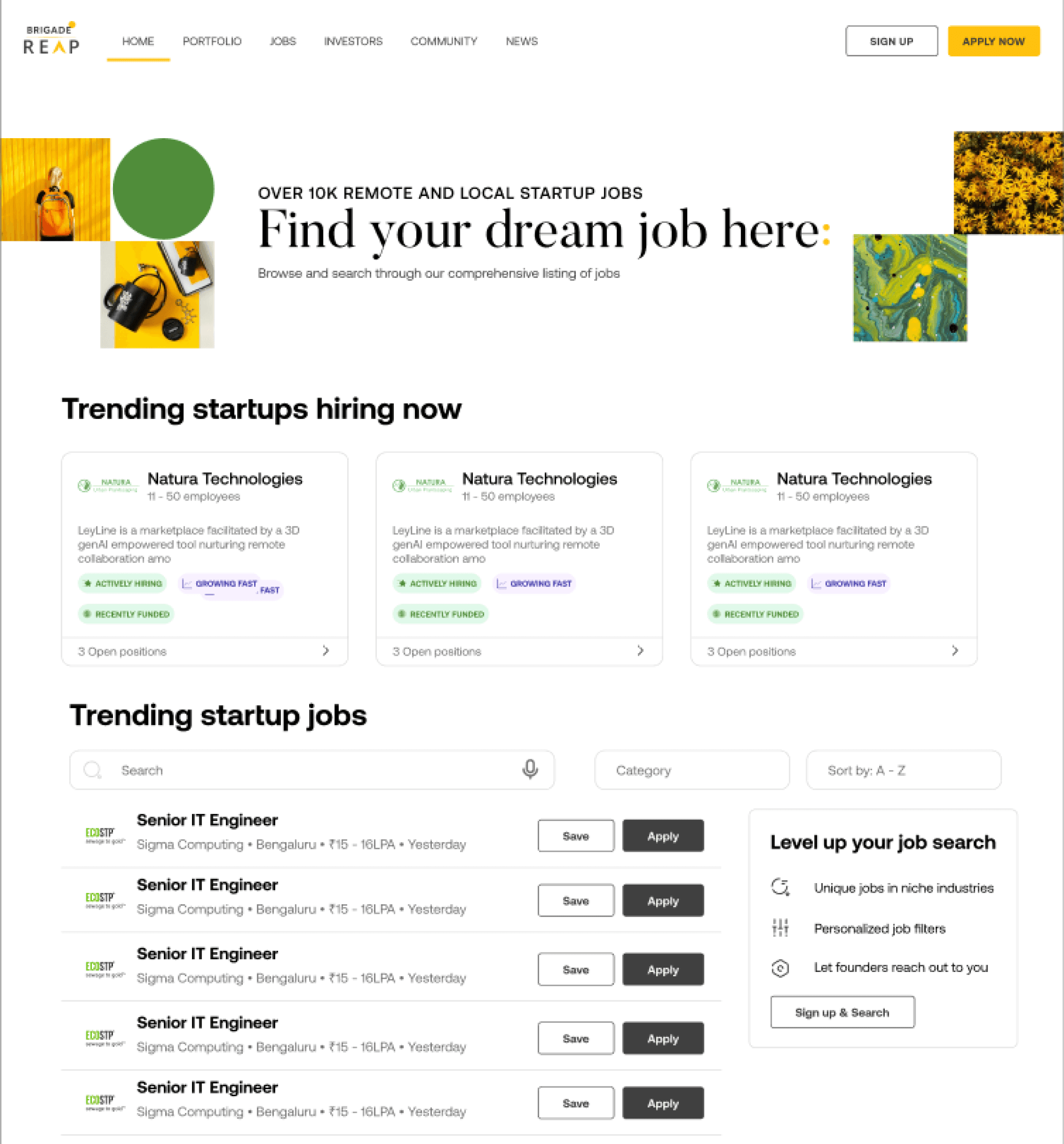
Value propostion - Information about the job listings page
Trending Startups Header - reducing the cognition of searching with a highlights feature
Jobs - with a search bar, category option and filters
Job Listings Page
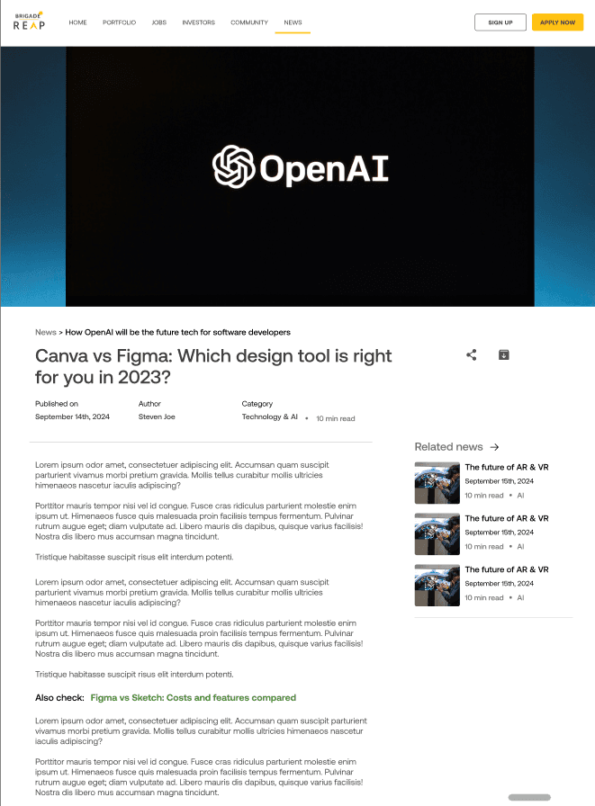
Highlighted heading of the topic
Suggestions of other news
More news section after the news/blog has been read keeping the users engaged

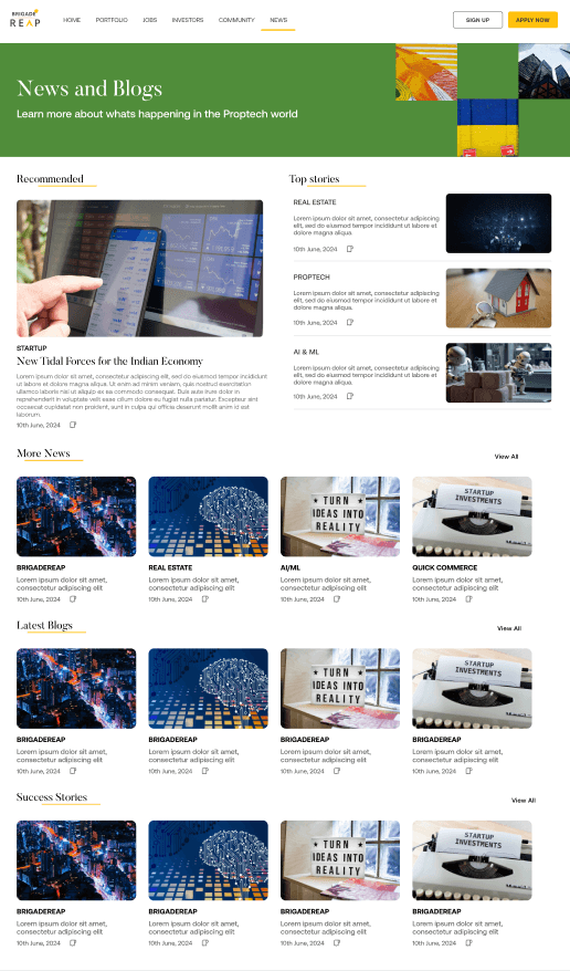
Success stories of BrigadeREAP Platform
News and blogs have been categorized based on latest, trending and more.
Detailed News Page
News and Blogs Page

Events page has been categorized with sections such as Online events, Offline events. Placed with information about the event taking place

After clicking on join event - users must add their personal information to register and then it is sent to the admin to admit them

Success message validation after the registartion mail is sent to the user’s respective email id
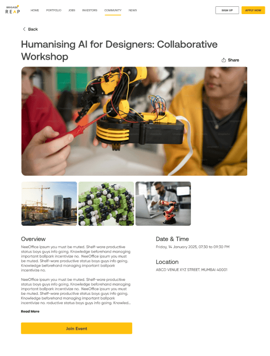
Event details Page - Added visual about the event along with overview and date & time with venue. A CTA has been added to join event
Events Page
Recommended section
Outcome
The redesign of BrigadeREAP's subpages, including the job listings, investors, news, and events sections, significantly enhanced user engagement and platform usability. By refining the information architecture and adding clear CTAs, we saw a 75% boost in event sign-ups and a 40% increase in job applications. This optimized, user-centered layout now better supports startups and investors, making it easier for them to find resources, connect with opportunities, and navigate the platform seamlessly.
Insight 3
As a product designer, I identified a critical feature gap in the platform: users lacked a clear way to track their data, engagement, and event creation, which limited their ability to monitor progress and actively participate in the ecosystem. This insight revealed the need for a centralized dashboard, enabling users to manage key metrics, track startup approvals, and stay informed on platform activities. Investors, too, required a streamlined event creation process, which led us to redesign the login/signup flows, ensuring a smooth onboarding experience. These UX enhancements were pivotal in elevating the user journey and supporting meaningful engagement on the platform.
Main Problem
The primary issue was the lack of a unified system for users to manage and track their activities. Without a dashboard, users found it challenging to oversee their data, monitor startup approval status, or participate fully in community events. This gap hindered user engagement, leaving them disconnected from the platform’s core functionalities, such as event creation for investors and progress tracking for startups.
Recommendation 3
To enhance user experience and engagement, implementing a centralized dashboard would be a key improvement. This dashboard should allow users to track essential metrics, including startup approval status, event participation, and overall engagement within the platform. Adding tailored features, such as real-time notifications for updates on startup progress and event management tools for investors, would streamline interactions and increase platform utility.
Additionally, a revamped login/signup process is essential to improve onboarding, ensuring that users can quickly access their personalized data and begin utilizing the platform’s features effectively.
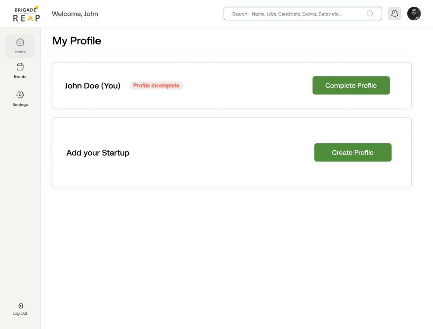
First time users in the platform - dashboard

Signup Screen
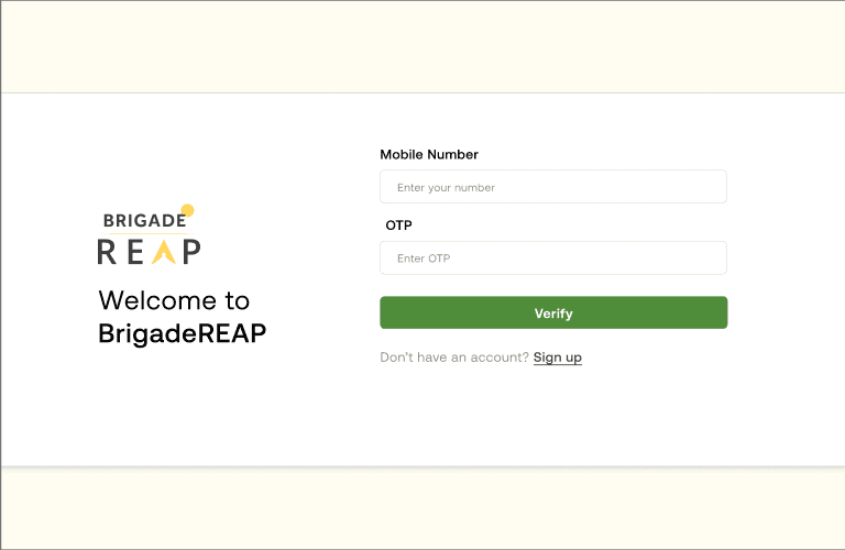
Login Screen
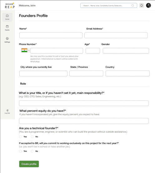
Profile form of the founder of the startup

Success Validation after form submission

Startup Incubation Form
Cards for setting no. of people, host name etc

Final page once event details have been set
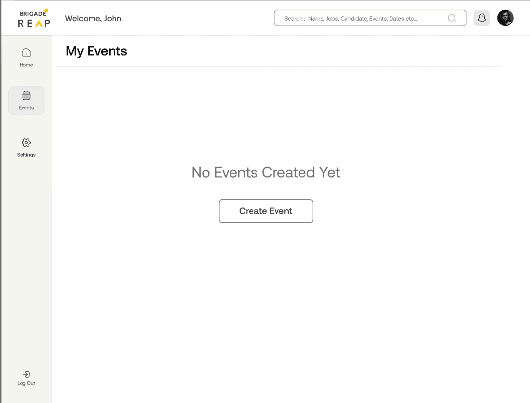
No event creation screen. A CTA to create events

Anyone in the dashboard after signup/login can create events and then sent to the admin for approval
Success Validation

Confirmation popup for startup approval
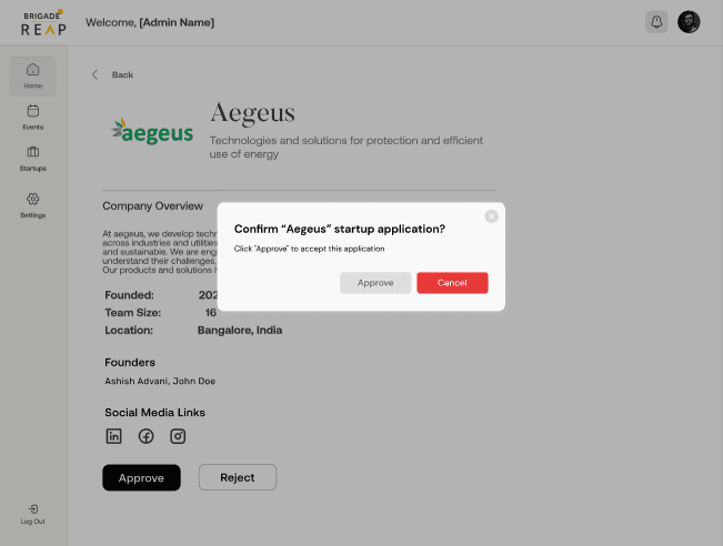

Startup overview - With approve and reject CTA’s
Admin Dashboard

Home screen - Admin checks the startup applications and event applications for approval along with status of it

Event Application - with two CTA’s of either approve or reject
Event Creation Page
Learnings
Embracing Complete Ownership in Design
Taking full responsibility for the design process of this project was an empowering experience that taught me the importance of being adaptable and resourceful. From ideation to execution, I managed each aspect of the design, which strengthened my ability to make autonomous decisions and instilled a deeper sense of accountability. This ownership enabled me to approach challenges proactively, focusing on delivering a cohesive, user-centered experience.
Iterative Design through Client Feedback
Regular meetings with the brand for feedback allowed me to refine the design iteratively. These feedback sessions emphasized the importance of being open to change and responsive to stakeholder insights. By actively incorporating feedback, I learned to balance client expectations with user needs, ensuring that the final product aligned with the brand’s vision while providing a seamless user experience.
Importance of Detailed Documentation and Communication
Throughout this project, clear and thorough documentation became essential, especially when coordinating with cross-functional teams and stakeholders. Maintaining organized records of decisions, iterations, and feedback helped streamline communication and kept everyone aligned, ultimately contributing to a smoother design process and a more efficient workflow. This experience reinforced the value of structured communication for effective project management and successful outcomes.
Outcome
The redesign of the dashboard for both users and admins significantly improved the platform's usability and engagement. For startup founders and event creators, structured onboarding, clear guidance, and progress tracking provided a transparent, reassuring experience, reducing cognitive load and allowing efficient event setup with customizable options. For admins, the streamlined workflow with efficient application review, error prevention through confirmation popups, and instant feedback enhanced decision-making and accuracy. Real-time status updates fostered transparency and trust, making the dashboard a trusted, user-centered tool that improved engagement, efficiency, and satisfaction for all users.
Other Featured Projects

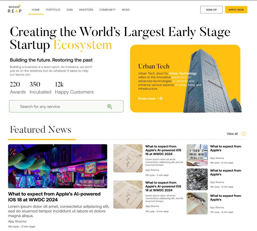

Clear value proposition about the platform
Hero Image
More information about the platform
News section - regarding proptech, AI, ML, or any field
Added a search bar so that the users can find any service that they require at a first glance reducing the clicks
Companies funded + incubated
Some extra information about brigadereap, along with a CTA for incubators to apply in. Showcasing a timeline of metrics
Research
To tackle the challenges around user retention and platform clarity on BrigadeREAP, I carried out comprehensive research to understand and address user needs effectively. This research included competitor analysis, user interviews, user flows, mood board and low-fidelity wireframing, which provided valuable insights to inform our design approach:
01
User Flows & Wireframes: Mapped out user flows to understand each journey, creating wireframes to streamline navigation and ensure the platform's core value was clearly communicated to each user group.
02
Mood Board & Visual Direction: Developed mood boards to capture the brand’s identity and values, aiming for a look and feel that resonated with entrepreneurial ambition and innovation in proptech. This guided the visual design toward a professional and cohesive user experience.
03
Usability Testing: Conducted usability tests with early prototypes to observe user interactions, validating the new navigation structure and verifying that critical platform information was easily accessible.
Recommendation 1
Enhance BrigadeREAP’s value proposition by clearly articulating the platform’s offerings, user benefits, and success stories to establish credibility. Simplify language and implement a well-structured content hierarchy that guides users through key information seamlessly. This approach will reduce confusion, improve readability, and help users quickly understand the platform’s unique value and the tangible benefits it has delivered to others, thereby increasing user trust and engagement.

PhysioEducator
Platform for physiotherapy students to access live courses and for tutors to manage classes easily.
Get in touch at
ahona@ahonakar.digital